A question virtually all of my mentees have asked me is, “What makes a great first data science capstone project?” In this blog post, I’ll break down the first project from one of my previous mentees (Paul Brume), who used this project to land a job at Synthego while he was taking the course. (Congrats, Paul!)
First, about me: I’m Danny Wells. I’m a data scientist at the Parker Institute for Cancer Immunotherapy. I’ve been mentoring for Springboard for about 18 months and in that time have worked with more than 30 mentees, many of whom now have data-driven roles across the U.S.
Going in: you’re making a project for your data science portfolio
Let’s get this out of the way:
- Your resume (plus maybe a connection through your college roommate’s third cousin) will get you that first interview;
- and your sick knowledge of pandas, sklearn, and Python will get you past a technical screen;
- but it’s your portfolio of data science projects that will get you that sweet, sweet data science job offer.
Your portfolio is your secret weapon to show off what you can really do. At its best, your portfolio will give your prospective team and manager insight into how you think, how you ask questions, how you code, and how you present your results to a non-technical audience. It’s perfect for answering that innocuous (but critical) interview question:
“Tell me about a data science project you’ve worked on.”
So when you’re thinking about your first project, think about it in the context of something you want in your portfolio.
Paul was a consultant before starting in Springboard’s Data Science Career Track and knew he wanted a top-notch project to add to his portfolio that would show off his analysis skills plus his ability to present results professionally to non-experts. What he ultimately produced was an exceptional piece of work and became the cornerstone of Paul’s portfolio (and helped him land his job).
OK, let’s dive into Paul’s project.
Choosing data
One of the most important decisions when creating a data science project is the first one you’ll make:
What data should I work on?
If you’re initially stumped, don’t worry: this is hard! Below I’ve compiled some tips on how to choose data to set yourself up for an awesome project:
Data size: in general, there’s no such thing as a data set that’s “too small” or “too big.” But for your first project, having lots of rows and columns in your data is extremely helpful to make sure you can find results. In general, aim for:
- Have at least 50 columns
- Have at least 10x more rows than columns
Data topic: it might sound obvious, but you want the data you’re working on to be interesting to you. Interest is the key force behind the most important concept in data science: asking good questions. If you don’t care about a topic, it’s much, much harder to ask good questions about it.
Data availability: another no-brainer, but if we’ve learned anything from the internet, not everything is as it appears. So before you commit to your project, confirm you can get the data by downloading it and examining it using a tool like Excel. Does it look like you expect (or, you know, are all the column names in Russian)?
For Paul’s project, he was really interested in understanding the rise of peer-to-peer lending services, companies that take the bank out of the equation and let you directly lend to someone else. Luckily for Paul, one of the premier start-ups focused on peer-to-peer lending, Lending Club, has made a ton of data available (check it out here). So without too much pain, Paul was able to download a data set with 42,540 rows and 143 columns. This is the perfect-size data set to start your project: large enough to be able to apply machine learning, small enough that it can still fit (comfortably) in memory!
Data wrangling
OK, so here’s a not-so-secret secret about data science: while the other-worldly predictive models and hyper-engaging data visualizations get all the love, most data scientists spend the majority of their time cleaning and wrangling data. It’s not that building models and visualizations aren’t what we all want to be doing, it’s just that most data is messy. Like, really messy.
Making messy data clean is the most important step before starting the data science process. Without cleaning, no amount of deep learning voodoo is ever going to move the needle of your machine learning predictor. Said a different way, garbage in, garbage out.
For Paul’s data wrangling process, he focused on two key areas:
- Cleaning up and getting rid of extraneous columns or columns that leak information from the future.
- Feature engineering—i.e., creating new features from the data present in his columns that he felt may add predictive power to his model.
Note, however, that each project is unique—for a different data set there could be extensive amounts of work even just getting data in a tabular format.
Or the data could come in a table but many of the columns are a mess—mixed data types, garbled strings, missing values.
Or maybe it’s tabular and clean but requires extensive featurization to be able to build your predictive model.
Or… well, you get the picture. When it comes to data cleaning, it’s best to go in with an open mind as to what’s needed.
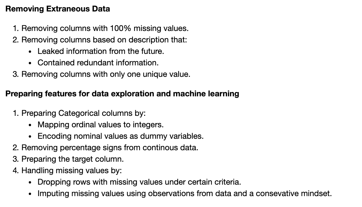
In Paul’s project, he spent a lot of time just getting comfortable with the data before he started cleaning it. Once he had a grasp on it, he did the perfect thing: made a plan of (data cleaning) attack, and executed it!

(Paul’s plan.)
I love Paul’s systematic approach here because too often data scientists approach data cleaning in a somewhat haphazard way—do a little here, a little there, throw away a few columns, change a few strings, and call it a day. This approach will get you going sooner, definitely. But it also could come back to bite you when you think you have a model with a 0.98 accuracy score, only to realize that a single (seemingly innocuous) column in your data is just a linear transformation of the feature you are trying to predict. Yikes!
Get To Know Other Data Science Students
Pizon Shetu
Data Scientist at Whiterock AI
Esme Gaisford
Senior Quantitative Data Analyst at Pandora
Jasmine Kyung
Senior Operations Engineer at Raytheon Technologies
Data exploration
OK, once your data is cleaned, what’s the next step? Rather than zoom into building a predictive model, spend some time exploring the data—hunt down patterns using your own intuition, and try to quantify them.
Why do this? Well, machine learning is great, but for the most part, it can’t tell you why something is true. The only models that come close—linear and logistic regression—are so limited that they can often miss basic relationships. So until the rise of artificial general intelligence, exploring the data on your own can often uncover relationships and patterns that no amount of modeling would.
In Paul’s project, he approached data exploration in exactly the right way: with a question. Paul grokked that, while data exploration is by definition exploratory, it helps to have some sense of direction, and for data analysis, the direction is set by the question(s) you want to answer. In Paul’s case, the question was:
Where in the risk spectrum do Lending Club borrowers fall? That is, what makes a good (non-risky) lending club loan? What makes a risky one? And how does Lending Club account for these risk factors?
To approach this big question, Paul did what all great scientists do: he broke it down. So with the question above as his inspiration, Paul asked a series of other, smaller, more concrete questions:
- How does FICO score associate with the likelihood that a borrower will default on their loan?
- How does credit age associate with default likelihood, and is this risk independent or associated with FICO score?
- How does home mortgage status associate with default likelihood?
- How does annual income associate with default likelihood?
- How does employment history associate with default likelihood?
- How does requested loan size associate with default likelihood?
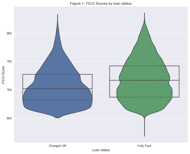
For each question, Paul made a series of plots to explore relationships within the data associated with that question, and upon finding a potential trend, quantified the likelihood that the trend was not due to chance by using frequentist statistics. For example, to explore the association between FICO score and default likelihood, Paul first visualized the distribution of FICO scores between individuals with fully paid vs. defaulted loans:

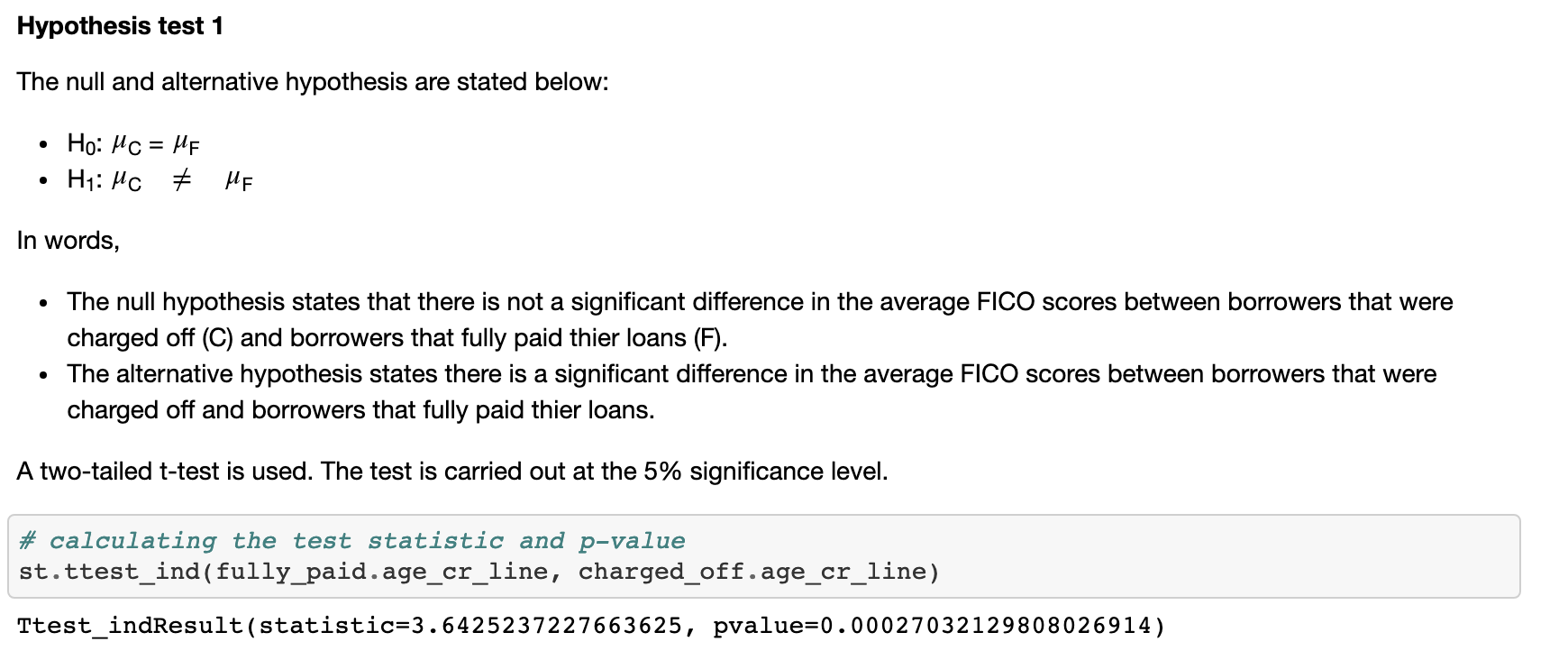
From this figure, Paul hypothesized that individuals with charged-off loans would have a lower credit score. To quantify this, Paul performed a t-test:

Building on this result, Paul next asked whether there was a truly linear relationship between FICO score and the likelihood of default. He binned FICO scores into six groups, and for each group calculated the likelihood of default:

Paul quantified this trend using a correlation test:

The p-value of zero and correlation of -1.0 emphasize the strength of this result. From these results, Paul concluded that FICO score was, in fact, an important predictor of the risk of default.
Paul’s approach to answering questions during the exploratory analysis part of his project demonstrates a “can’t lose” five-step formula to great exploratory data analysis:
- Ask a big, important question that you and others want the answer to
- “What factors are associated with the likelihood of default on a loan?”
- Break it down into smaller sub-questions
- “How does FICO score associate with the likelihood of default?”
- For each sub-question, make a plot or two visualizing the question
- In Paul’s case, he used a violin plot to examine the difference in FICO score between default and fully paid and used a scatter plot to examine the relationship between FICO score and default likelihood.
- For each plot, quantify what you see using statistics
- Paul used a t-test to quantify the trend in the violin plot, and a Spearman correlation test to examine the correlation in his scatter plot.
- Once you have answers to the above questions, ask your next (sub) question
- In Paul’s case, he began exploring the relationship between FICO score and other variables, such as employment length.
Iterate on the above three or four times, and baby, you got a data project for your portfolio going!
Machine learning
Now for the section, we’ve all been waiting for. The term “machine learning” (or its more generic cousin “artificial intelligence”) gets tossed around a lot these days and sometimes it can be confusing to understand what these tools actually do. In general, there are two large classes of machine learning:
Supervised machine learning methods use a set of training data to learn patterns and relationships between variables that enable an outcome (dependent) variable to be predicted.
Unsupervised machine learning methods look for patterns in data without an outcome variable—most often to identify clusters within the data that represent distinct (potentially as-of-yet unidentified) classes.
Paul wanted to build on the exploratory work he had done previously, so he decided to take a supervised machine learning approach. Using the tools of machine learning, Paul sought to build a predictor that would, from a given set of data about a potential borrower, predict whether that individual would ultimately default on their loan.
The first choice Paul had to make before he began his machine learning process was identifying which **metric** he should use. A metric, in the context of machine learning, is how well you measure the performance of your model. Typically, the larger the value, the better the model (but numerous exceptions to this exist). Different data sets and different questions lend themselves to different metrics.
Since there were far fewer cases of default borrowers compared to borrowers who paid off their entire loan, Paul had to confront that bane of data scientists everywhere: imbalanced classes. These occur when one class of the outcome variable is much more common than another. The challenge in these situations is that it can be very hard to accurately predict the lesser-represented class. To overcome this, Paul made a wise choice and decided to use the Area Under the Receiver Operator Characteristic Curve. I won’t go into detail about how the metric works (that’s what Wikipedia is for), but suffice it to say, it is a great choice when confronting imbalanced classes.
With his metric decided upon, Paul chose his model. The process through which he did so is called “cross validation.” The idea is, first, split your data into N parts (called “folds”). Next, choose a method (say, logistic regression) and a set of parameters for that method, and then for each fold, train the model on the remaining N-1 folds, and finally, test it on the fold you left out.

Cross-validation is important because it prevents overfitting, perhaps the most common (and often the hardest to overcome) error in all of data science.
In Paul’s case, the code he wrote to do cross-validation looks like this:

For his logistic regression model, Paul decided to cross-validate over two parameters:

C: the regularization parameter, essentially a penalty on adding new features to the model class_weight: how should different classes be weighted, essentially a modification of the AUROC metric which gives a higher reward/penalty for being correct/incorrect in certain cases.
When he deployed his cross-validation to his data set, Paul identified the optimal parameter combinations as well as the AUROC for his test data set:

This value of AUROC = 0.696 is a substantial improvement over the initial model that Paul started with (not shown).
Lastly, notice the section “Confusion matrix.” A confusion matrix visualizes where a model was correct (true positives and true negatives, on the diagonal) and where it went wrong (false positives, lower left; false negatives, upper right). It can be visualized like this:

A confusion matrix is a great way to summarize the state of your model and to identify places for improvement. Here you can see that, while Paul’s model is correctly predicting the majority of both “Fully Paid” and “Charged Off” loans, it still could use some improvement in reducing false positives (lower left)—borrowers who were predicted to be charged off but who fully paid. See the rest of Paul’s article to see how he addressed this.
Overall aesthetics
So, you’ve done it all:
- Acquired the data
- Cleaned the data
- Explored and visualized the data
- Modeled the data using machine learning
That’s enough, right?
It’s certainly a good start, but one area where I see many mentees come up short is the final step making their whole repo look and read professional. Paul was a consultant previously and did a great job with this, and there are a few things he did that I want to highlight:
- Lots (and LOTS) of good comments. The best part about Jupyter notebook is that it allows code, figures, and writing to live side by side. Take advantage of this! As you read through Paul’s notebooks, take a look at where and how he explains his work.
- Great figures. Rather than just spit out metric upon metric, Paul includes a confusion matrix for every cross-validation procedure he does. This is extremely helpful as you’re browsing his repo, and also makes it more visually distinctive.
- Clean code. Trust me, the code here did not just appear out of Paul’s mind fully formed (wouldn’t that be nice!). Instead, there were errors, bugs, huge text outputs, weird results that didn’t make sense, comments to himself about what to do next—all usual things when working on a notebook. BUT, for publishing, Paul went through and cleaned those all out.
- Well organized. Paul’s repo reads like a (really nerdy, data-driven) novel—it clearly and logically explains how we went from one step to the next. You can see how Paul thinks and understand why he is doing each step.
On the whole, this step usually takes around 3-5 hours to complete—not that much after the 100+ hours you’ve put into a portfolio project. However, it is the most common step I see my mentees skipping, and substantially impacts the overall presentation of this work.
Summing it all up
Hopefully you can see now what a great (job-worthy!) project looks like, and can start working on one of your own. Since there was a lot of content, I’ll conclude with my top three tips for doing a great data science capstone project:
- Choose a good data set: a small, uninteresting, or otherwise hard-to-analyze data set will make it substantially harder to make a great project.
- Include all of the following:
- Data cleaning
- Data exploration, visualization, and statistical analysis
- Data modeling with machine learning
- Finish clean: after you’ve done all the work, clean up the repo and make it professional—add comments and figures, organize the code, and remove any non-essential cells.
Once you have a few projects, consider making a website to host them (easy to do with SquareSpace or the like), posting them on Twitter, or including them as direct links in your LinkedIn profile. Your data science portfolio is on its way!
Since you’re here…
Curious about a career in data science? Experiment with our free data science learning path, or join our Data Science Bootcamp, where you’ll get your tuition back if you don’t land a job after graduating. We’re confident because our courses work – check out our student success stories to get inspired.


