While data analysis is always technical (and sometimes even a little bit repetitive), you can still have fun with it. Playing around with existing online datasets is great practice, and you’ll find various data-driven projects put together by experts and aficionados, many of them available in open-source communities like Github.
What’s more, you can easily find data sets that relate to your non-data-related hobbies and interests, from your favorite TV show to tracking the 2020 election.
In this blog, we’ll cover some of the fun datasets you can use to hone your skills, which are free, publically available, and range from entertainment to animals to sports. For a more tailored approach to your learning journey, we’ve also organized the data sets into four top skills that all data analysts should master: data cleaning; data visualization; machine learning; and data analysis.
Get started below!
What Is a “Fun” Data Set?
“Fun” datasets concern topics that are of personal interest, and can be used to answer unexpected questions and explore relationships that aren’t immediately intuitive. Perhaps you start with a question or hypothesis, and then find a dataset to prove (or disprove) your theory. Or, you might even generate your own dataset using web scraping techniques or an open API. In fact, creating your own dataset enables you to collect, label, and prepare a clean dataset.
Working with fun datasets will make your data science portfolio more eye-catching to employers, who have probably seen their fair share of Netflix-inspired recommendation engines and Twitter sentiment analysis projects.
Play with your data as much as you can before you begin your analysis. See if you can cross-reference two different datasets to compare different variables. For example: how do rising gas prices affect hotel occupancy in different parts of the country?
The dataset should be rich enough to let you play with it and derive patterns. In other words, it must have at least a few thousand rows and at least 20-25 columns, and a reasonable mix of continuous and categorical variables.
These datasets can be a perfect way to find new inspiration within the data science world. In such a dynamic industry, it’s important to stay sharp. Practicing without pressure is a surefire way to boost your skills on your own.

Become a Data Scientist. Land a Job or Your Money Back.
Build job-ready skills with 28 mini-projects, three capstones, and an advanced specialization project. Work 1:1 with an industry mentor. Land a job — or your money back.
Fun Data Sets To Analyze
Data Cleaning
Funny Data
University of Rochester’s Human-Computer Interaction lab, along with the Language Technologies Institute, has created the first dataset for multimodal humor detection. Using language, visual, and acoustic features, this UR-FUNNY data set is a great jumpoff point for data cleaning. An updated version removed noisy data instances, so a great exercise would be to clean the original version, then compare your work to the available updates.
Video Game Culture Wars
Practice data cleaning by using an existing dataset and implementing your own limits. After the Gamergate controversy of a few years ago, tweets from a 72-hour window were compiled into this spreadsheet. Choose a path when working through the data, and get started on training yourself to automatically identify any irrelevant data.
Clever Weather Patterns
Brazil is the largest country in South America with balmy temperatures and plenty of rain. Using this large dataset on hourly weather data from over 100 stations, strengthen your data cleaning abilities by reading through the data, and understanding what to keep and what to delete.
Trending Shows on Streaming Platforms
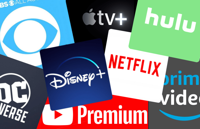
With so many streaming platforms to choose from, viewers have plenty of choices. From new releases to enduring favorites, the most-streamed shows make for an ever-changing dataset, and are often reflective of the current cultural zeitgeist (remember when Tiger King inspired all those pandemic-related memes?). Using this dataset on Netflix’s top 10 shows from March 2020 to March 2022, you can analyze what people were binge-watching throughout the COVID-19 pandemic.
Data Visualization
LEGO Bricks Data

This dataset was originally compiled to help people figure out how to repurpose the LEGO sets they already own. The data contains the LEGO parts, sets, colors, and inventories of every official LEGO set in the Rebrickable database. While the data is current as of July 2017, you can use the Rebrickable API to find more recent data. Using this dataset, you can explore questions such as: What sets have the most used pieces in them? What are the rarest LEGO pieces? How have the sizes of LEGO sets changed over time?
The Nutritional Value of Starbucks Drinks
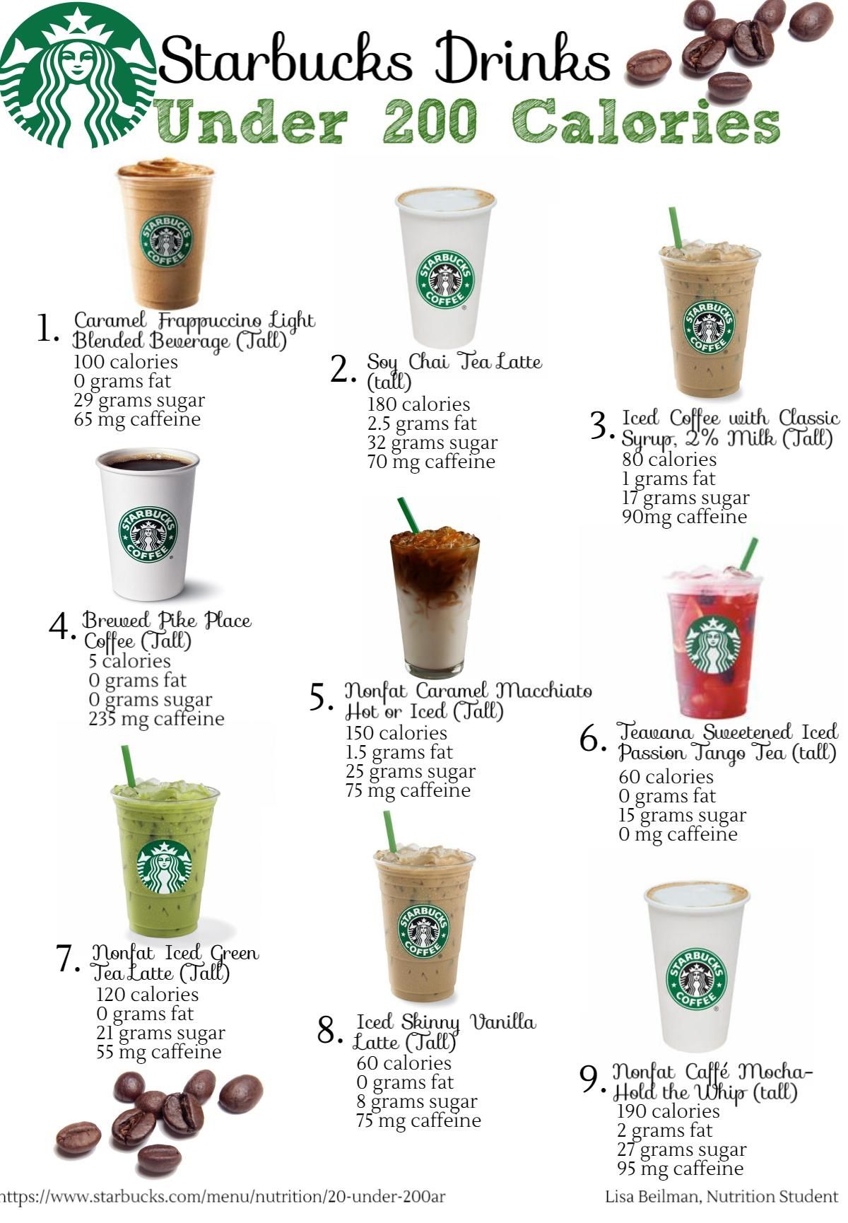
Ever wondered how much sugar and fat goes into your favorite coffee drinks? Because of branding, it’s easy to assume that food items from Starbucks are healthier than McDonald’s, but you can’t know that for sure without digging into the data. This dataset from Kaggle contains nutrition facts for menu items from both Starbucks and McDonald’s. You can use one or both sets of data to compare the nutritional values of similar food and drink items and visualize your findings.
Global Warming Trends
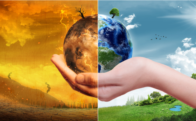
This dataset by data science nonprofit Berkeley Earth reports on how land and ocean temperature vary by location. This data is already cleaned and packaged, making it a great start for data analysis. For data that dives deeper into global surface temperature anomalies, you can visit here. Try creating a line graph as data visualization to show temperature changes over time.
Bachelor Winners
Did you know that you can use data analytics to figure out who will win The Bachelor next season? This article also shows how an avid viewer created a dataset on the demographic data of Bachelor contestants, and utilized data visualization to communicate his findings. Break down the data to take note of the winners’ shared attributes and find any trends that can pinpoint from the start who will find love. Maybe you’ll even outsmart your friends during your next Bachelor wine night.
Get To Know Other Data Science Students

Melanie Hanna
Data Scientist at Farmer's Fridge

Leoman Momoh
Senior Data Engineer at Enterprise Products

Jonas Cuadrado
Senior Data Scientist at Feedzai
A Smarter Way to Play Fantasy Football
Exercise your data visualization skills while keeping tabs on your favorite fantasy football team. You can discover patterns in The Football Database that can help decide your starting lineup. From there, create graphs to plot relevant data points to present to the rest of your league to boost everyone’s experience. Refer to the graphical representations you’ve created to improve your performance each season.
POTUS’s Twitter Account
Try and create a graphical representation of Donald Trump’s Twitter account based on this dataset. Analyze the data to discover patterns within sentiment, word priority, active hours and days of the week, and more. Once you have the answers you’re looking for, you can play around by creating graphics that display what you’ve gathered.
Who Rules the Kardashians?

If you’re a fan of reality TV’s most powerful family, build up your data visualization prowess by figuring out who the most famous Kardashian actually is. The data, contained in this tutorial, is already out there to explore tendencies within the family and their relationship with the media.
You can study and organize this data to create visual graphics that communicate who takes the cake amongst the Calabasas queens.
Machine Learning
Fake Job Posts

Scammers use fake job posts to steal people’s identities by posting unusually enticing job descriptions, and then requiring applicants to provide their Social Security numbers and personal details upfront, ostensibly so they can be considered for an interview. This Kaggle dataset compiled by data scientist Shivam Bansal contains 18,000 job descriptions, of which about 800 are fake. The data consists of both textual information and meta-information about the job posts. You can use the data to create classification models to determine which job posts are fraudulent or real.
Jeopardy! Questions
If you’re ready to take on an advanced machine learning project, this Kaggle dataset by data scientist Bojan Tunguz contains over 200,000 questions from the popular game show Jeopardy!, and can be used for multiple purposes. For example, you can run classification algorithms to predict the category or dollar value of the question. Or, you can take things up a notch and train a BERT model, a language model for natural language processing (NLP).
Million Song Dataset
For any pop or contemporary fans out there, this dataset was created under a grant by the National Science Foundation to encourage research on algorithms that scale to commercial sizes. Derived features are taken from a million contemporary popular music tracks that can serve as the foundation for your predictive analysis of what will—or won’t—be a hit.
Data Analysis
New York City Squirrel Census
A native New Yorker data enthusiast, with the help of over 300 volunteers, counted and observed the squirrels living in the city—all to gather an immense amount of data that can be found here.
Knowing how to ask the right questions is an important data analytics skill, and this dataset can be a great tool to study and come up with questions that can be answered with this squirrel census. Some might include their most frequented bodega trash cans, most popular coat patterns, or where they summer.
Bigfoot Sightings
Despite limited physical evidence attesting to the existence of Bigfoot, about 11% of US adults believe the eight-foot-tall, ape-like creature is real. This dataset from the Bigfoot Field Researchers Organization (BFRO), an organization dedicated to investigating the Bigfoot mystery, contains publicly available sighting data in a digestible form. You can use the data to analyze geographical and meteorological trends associated with Bigfoot sightings and the types of evidence compiled (eg: direct sighting, noises, tracks, etc), for example.
Pokémon
Data pulled from all seven generations of Pokémon has been scraped here, including base stats, height, weight, abilities, and more. The dataset can identify the weakest and strongest types of Pokémon, and identify legendary Pokémon. You can easily come up with a few questions that can be answered from the given information and practice your analytics skills.
Harry Potter

Ever wonder which Hogwarts House you’d be sorted into? Trying to decide your favorite character? Use these Harry Potter datasets to extract a definitive answer. Here are our favorites:
- This dataset provides a detailed list of each movie’s characters and their demographic information.
- This dataset dives deep into language processing and sentiment analysis within the movies.
- If you want to go beyond the books, use this data set for 111,963 Potter fanfiction titles, authors, and summaries.
Datasets for Dog Lovers
Becoming a dog owner requires extensive research and preparation. Use this data gathered in Germany to practice your analysis skills and answer frequent dog-related questions. Some examples include: What breeds thrive in which climates? And what dogs are best with children?
Top 6 Sources To Find Data Sets
Even if you’ve never worked on a paid data science project before, the internet has plenty of publicly available data that you can use for your personal projects. And with those projects, you can build a stellar portfolio. Here is a list of sources where you can find free, publicly available datasets on everything from crime to science, politics, and more.
1. UCI Machine Learning Repository
The UCI Machine Learning Repository by the University of California Irvine contains over 600 datasets on everything from bone marrow transplants in children to data on automobile fuel efficiency. Best of all, the datasets are categorized by task (eg: classification, regression, or clustering), data type, and area of interest.
2. Github’s Awesome-Public-Datasets
This Github repository contains a long list of high-quality datasets, from agriculture, to entertainment, to social networks and neuroscience. Working on such datasets would undoubtedly enable you to improve your abilities as an aspiring data scientist. You can join the associated AwesomeData Slack channel to ask questions about the data or contribute your own dataset.
3. Pew Research Center
If your area of interest is culture, sociology, and current events, visit the Pew Research Center’s data repository, which contains datasets and surveys covering media consumption, social media use, and demographic trends. Each dataset comes with reports that were released from the data, which can be a good starting point for your own analysis.
4. BuzzFeed News Github
Buzzfeed News has emerged as a credible news source with its hard-hitting investigative journalism. Here, you can access the data repositories used in some of the top investigative stories published on Buzzfeed News, including data on firearm background checks, political campaign donors, gentrification, and more.
5. FiveThirtyEight
An award-winning data journalism website, FiveThirtyEight makes its datasets publicly available. The datasets are highly curated and some of them come with the code associated with the visualizations and graphics used in the original news article. If you’re interested in analyzing data about current events, FiveThirtyEight datasets are added several times a day and are meant to answer some of the most pressing questions of the day.
6. Data.world
Data.world is a data catalog service (like a search engine for datasets) and is home to the world’s largest collaborative data community, which is free and open to the public. Anyone can use data.world to create a workspace or project that hosts a dataset, and you can share your analysis with the community to get feedback on your work.
Related Read: 15 Free Data Sets for Your Next Project or Portfolio
FAQs About Analyzing Data Sets
How Big Is a Data Set?

Datasets used for analytics vary in size. A 2015 poll by KDNuggets found that most users worked with datasets in the 10 megabytes to 10 terabytes range, with a minority of users tackling petabyte-sized datasets. Generally speaking, the larger your dataset, the more representative it is, especially when training machine learning models.
What Is the Process To Analyze a Data Set?
- Define the Problem
Start by defining a question you want to answer. Business problems can be quite open-ended. The question “Why are we losing customers?” can have multiple answers, so it helps to further define the problem using contextual information. For example, you might decide to use data to investigate what factors are negatively impacting the customer experience.
- Collect Your Data
Once you’ve established your objective, you’ll need to create a strategy for aggregating the appropriate data. This might include quantitative (numeric) data, such as sales figures, or qualitative (descriptive) data, such as customer reviews. Then, you’ll use a data management platform to collect and analyze data from numerous sources, such as your organization’s CRM (Customer Relationship Management) tool.
- Clean Your Data
Cleaning your data—or wrangling it—involves eliminating duplicates, missing values, and redundancies that create noise in your data. Doing this transforms raw data into a usable format for analysis. The amount of data cleaning you must do depends on several factors, such as whether you’re using first-party (data your organization collects directly from customers), second-party (first-party data from other organizations), or third-party data (data aggregated by an outside organization). Unstructured data requires more cleaning because it may lack standardized naming conventions and formatting rules. And this is where you’ll perform an exploratory data analysis (EDA) to identify trends and characteristics in the data.
- Analyze the Data
Before you analyze your data, it may be useful to segment it. For example, if you’re analyzing sales data, you may wish to break it down by region or product category. From there, you can glean insights about specific groups or make comparisons between them. The type of data analysis technique you use depends on the question you’re trying to answer.
- Bivariate and Multivariate Analysis
One of the simplest forms of statistical analysis, bivariate analysis is the process of determining a relationship between an independent variable and a dependent variable. This relationship is usually expressed in the form of a linear equation that tells you the strength of the correlation, or a correlation coefficient (a value from 0-1 that indicates a positive or negative relationship).
- Cohort Analysis
Cohort analysis involves examining groups or segments of your data to determine their common characteristics. For example, you might want to understand what product categories are most popular in a specific region, or the demographic makeup of your top buyers.
- Time Series Analysis
Time series analysis is a statistical technique used to identify trends and patterns over time. Using this technique, you can measure the same variable at different points in time. Time-related trends can help you understand what factors might cause the variable to change (eg: cyclic patterns or seasonality) and forecast how it may fluctuate in the future.
- Factor Analysis
Factor analysis is a technique used to reduce a large number of variables into a smaller number of factors. This technique works by finding data points that are strongly correlated, which is known as covariance. For example, say there is a strong relationship between the customer’s region and household income, you can group this into a single factor such as “consumer purchasing power.” This leaves you with a smaller number of factors rather than hundreds of seemingly unrelated variables. You can then explore these factors for further analysis.
- Visualize Your Data
Data visualizations are the best way to communicate your findings with non-technical stakeholders. Visuals should be based on the following questions:
- Who is my audience?
- What questions do they have?
- What answers do I have for them?
- What other questions will my visualizations inspire?
Related Read: Top 13 Best Data Visualization Courses
Where possible, use a range of formats to communicate your findings—from dashboards to interactive graphs—to help viewers understand the issue from different angles.
Are Some Data Sets Better Than Others?
First and foremost, a good dataset contains the elements and variables you need for your specific analysis. For example, a time series analysis is a great way to visualize changes over time, but it requires data that contains a date or timestamp. You may also need to contextualize your data by using a third-party data source. For example, say you’re analyzing the education outcomes of a specific demographic group. How does this cohort compare with the rest of the population?
A good dataset is disaggregated. An example of this would be differentiating test scores for students with various learning abilities, instead of aggregating data on the entire student population. You should also look for datasets that have metadata or a data dictionary if the fields aren’t already well-labeled. A data dictionary provides information about column names and members in a column. The data should also be relatively easy to manipulate. If the data requires an outsized amount of effort to clean up, it might be incomplete or filled with inaccuracies.
Since you’re here…
Curious about a career in data science? Experiment with our free data science learning path, or join our Data Science Bootcamp, where you’ll get your tuition back if you don’t land a job after graduating. We’re confident because our courses work – check out our student success stories to get inspired.