
Data mining and algorithms
Data mining is the process of discovering predictive information from the analysis of large databases. For a data scientist, data mining can be a vague and daunting task – it requires a diverse set of skills and knowledge of many data mining techniques to take raw data and successfully get insights from it. You’ll want to understand the foundations of statistics and different programming languages that can help you with data mining at scale.
This guide will provide an example-filled introduction to data mining using Python, one of the most widely used data mining tools – from cleaning and data organization to applying machine learning algorithms. First, let’s get a better understanding of data mining and how it is accomplished.
A data mining definition
The desired outcome from data mining is to create a model from a given data set that can have its insights generalized to similar data sets. A real-world example of a successful data mining application can be seen in automatic fraud detection from banks and credit institutions.
Your bank likely has a policy to alert you if they detect any suspicious activity on your account – such as repeated ATM withdrawals or large purchases in a state outside of your registered residence. How does this relate to data mining? Data scientists created this system by applying algorithms to classify and predict whether a transaction is fraudulent by comparing it against a historical pattern of fraudulent and non-fraudulent charges. The model “knows” that if you live in San Diego, California, it’s highly likely that the thousand dollar purchases charged to a scarcely populated Russian province were not legitimate.
That is just one of a number of the powerful applications of data mining. Other applications of data mining include genomic sequencing, social network analysis, or crime imaging – but the most common use case is for analyzing aspects of the consumer life cycle. Companies use data mining to discover consumer preferences, classify different consumers based on their purchasing activity, and determine what makes for a well-paying customer – information that can have profound effects on improving revenue streams and cutting costs.
If you’re struggling to find good data sets to begin your analysis, we’ve compiled 19 free data sets for your first data science project.
What are some data mining techniques?
There are multiple ways to build predictive models from data sets, and a data scientist should understand the concepts behind these techniques, as well as how to use code to produce similar models and visualizations. These techniques include:
- Regression – Estimating the relationships between variables by optimizing the reduction of error.

An example of a scatterplot with a fitted linear regression model.
- Classification – Identifying what category an object belongs to. An example is classifying email as spam or legitimate, or looking at a person’s credit score and approving or denying a loan request.
- Cluster Analysis – Finding natural groupings of data objects based upon the known characteristics of that data. An example could be seen in marketing, where analysis can reveal customer groupings with unique behavior – which could be applied in business strategy decisions.
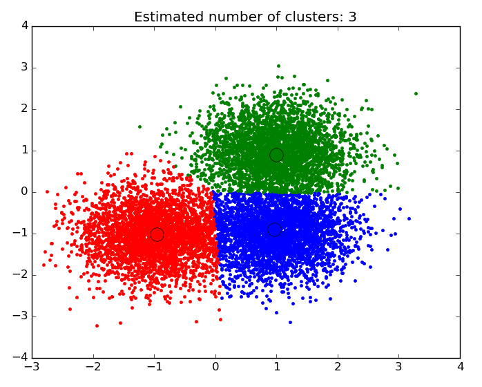
An example of a scatter plot with the data segmented and colored by cluster.
- Association and Correlation Analysis – Looking to see if there are unique relationships between variables that are not immediately obvious. An example would be the famous case of beer and diapers: men who bought diapers at the end of the week were much more likely to buy beer, so stores placed them close to each other to increase sales.
- Outlier analysis – Examining outliers to examine potential causes and reasons for said outliers. An example of which is the use of outlier analysis in fraud detection, and trying to determine if a pattern of behavior outside the norm is fraud or not.
Data mining for business is often performed with a transactional and live database that allows easy use of data mining tools for analysis. One example of which would be an On-Line Analytical Processing server, or OLAP, which allows users to produce multi-dimensional analysis within the data server. OLAPs allow for business to query and analyze data without having to download static data files, which is helpful in situations where your database is growing on a daily basis. However, for someone looking to learn data mining and practicing on their own, an iPython notebook will be perfectly suited to handle most data mining tasks.
Let’s walk through how to use Python to perform data mining using two of the data mining algorithms described above: regression and clustering.
Creating a regression model in Python
What is the problem we want to solve?
We want to create an estimate of the linear relationship between variables, print the coefficients of correlation, and plot a line of best fit. For this analysis, I’ll be using data from the House Sales in King’s County data set from Kaggle. If you’re unfamiliar with Kaggle, it’s a fantastic resource for finding data sets good for practicing data science. The King’s County data has information on house prices and house characteristics – so let’s see if we can estimate the relationship between house price and the square footage of the house.
First step: Have the right data mining tools for the job – install Jupyter, and get familiar with a few modules.
First things first, if you want to follow along, install Jupyter on your desktop. It’s a free platform that provides what is essentially a processer for iPython notebooks (.ipynb files) that is extremely intuitive to use. Follow these instructions for installation. Everything I do here will be completed in a “Python [Root]” file in Jupyter.
We will be using the Pandas module of Python to clean and restructure our data. Pandas is an open-source module for working with data structures and analysis, one that is ubiquitous for data scientists who use Python. It allows for data scientists to upload data in any format, and provides a simple platform organize, sort, and manipulate that data. If this is your first time using Pandas, check out this awesome tutorial on the basic functions!
In [1]:
import pandas as pd
import matplotlib.pyplot as plt
import numpy as np
import scipy.stats as stats
import seaborn as sns
from matplotlib import rcParams

%matplotlib inline
%pylab inline
In the code above I imported a few modules, here’s a breakdown of what they do:
- Numpy – a necessary package for scientific computation. It includes an incredibly versatile structure for working with arrays, which are the primary data format that scikit-learn uses for input data.
- Matplotlib – the fundamental package for data visualization in Python. This module allows for the creation of everything from simple scatter plots to 3-dimensional contour plots. Note that from matplotlib we install pyplot, which is the highest order state-machine environment in the modules hierarchy (if that is meaningless to you don’t worry about it, just make sure you get it imported to your notebook). Using ‘%matplotlib inline’ is essential to make sure that all plots show up in your notebook.
- Scipy – a collection of tools for statistics in python. Stats is the scipy module that imports regression analysis functions.
Let’s break down how to apply data mining to solve a regression problem step-by-step! In real life you most likely won’t be handed a dataset ready to have machine learning techniques applied right away, so you will need to clean and organize the data first.
df = pd.read_csv('/Users/michaelrundell/Desktop/kc_house_data.csv')
df.head()
df.isnull().any()
Checking to see if any of our data has null values. If there were any, we’d drop or filter the null values out.
df.dtypes
I imported the data frame from the csv file using Pandas, and the first thing I did was make sure it reads properly. I also used the “isnull()” function to make sure that none of my data is unusable for regression. In real life, a single column may have data in the form of integers, strings, or NaN, all in one place – meaning that you need to check to make sure the types are matching and are suitable for regression. This data set happens to have been very rigorously prepared, something you won’t see often in your own database.
Next: Simple exploratory analysis and regression results.
Let’s get an understanding of the data before we go any further, it’s important to look at the shape of the data – and to double check if the data is reasonable. Corrupted data is not uncommon so it’s good practice to always run two checks: first, use df.describe() to look at all the variables in your analysis. Second, plot histograms of the variables that the analysis is targeting using plt.pyplot.hist().
df.describe()
fig = plt.figure(figsize=(12, 6))
sqft = fig.add_subplot(121)
cost = fig.add_subplot(122)

sqft.hist(df.sqft_living, bins=80)
sqft.set_xlabel('Ft^2')
sqft.set_title("Histogram of House Square Footage")

cost.hist(df.price, bins=80)
cost.set_xlabel('Price ($)')
cost.set_title("Histogram of Housing Prices")

plt.show()

Using matplotlib (plt) we printed two histograms to observe the distribution of housing prices and square footage. What we find is that both variables have a distribution that is right-skewed.
Now that we have a good sense of our data set and know the distributions of the variables we are trying to measure, let’s do some regression analysis. First we import statsmodels to get the least squares regression estimator function. The “Ordinary Least Squares” module will be doing the bulk of the work when it comes to crunching numbers for regression in Python.
import statsmodels.api as sm
from statsmodels.formula.api import ols
When you code to produce a linear regression summary with OLS with only two variables this will be the formula that you use:
Reg = ols(‘Dependent variable ~ independent variable(s), dataframe).fit()
print(Reg.summary())
When we look at housing prices and square footage for houses in King’s county, we print out the following summary report:
m = ols('price ~ sqft_living',df).fit()
print (m.summary())
An example of a simple linear regression model summary output.
When you print the summary of the OLS regression, all relevant information can be easily found, including R-squared, t-statistics, standard error, and the coefficients of correlation. Looking at the output, it’s clear that there is an extremely significant relationship between square footage and housing prices since there is an extremely high t-value of 144.920, and a P>|t| of 0%–which essentially means that this relationship has a near-zero chance of being due to statistical variation or chance.
This relationship also has a decent magnitude – for every additional 100 square-feet a house has, we can predict that house to be priced $28,000 dollars higher on average. It is easy to adjust this formula to include more than one independent variable, simply follow the formula:
Reg = ols(‘Dependent variable ~ivar1 + ivar2 + ivar3… + ivarN, dataframe).fit()
print(Reg.summary())
m = ols('price ~ sqft_living + bedrooms + grade + condition',df).fit()
print (m.summary())
An example of multivariate linear regression.
In our multivariate regression output above, we learn that by using additional independent variables, such as the number of bedrooms, we can provide a model that fits the data better, as the R-squared for this regression has increased to 0.555. This means that we went from being able to explain about 49.3% of the variation in the model to 55.5% with the addition of a few more independent variables.
Visualizing the regression results.
Having the regression summary output is important for checking the accuracy of the regression model and data to be used for estimation and prediction – but visualizing the regression is an important step to take to communicate the results of the regression in a more digestible format.
This section will rely entirely on Seaborn (sns), which has an incredibly simple and intuitive function for graphing regression lines with scatterplots. I chose to create a jointplot for square footage and price that shows the regression line as well as distribution plots for each variable.
sns.jointplot(x="sqft_living", y="price", data=df, kind = 'reg',fit_reg= True, size = 7)
plt.show()

That wraps up my regression example, but there are many other ways to perform regression analysis in python, especially when it comes to using certain techniques. For more on regression models, consult the resources below. Next, we’ll cover cluster analysis.
- Visualizing linear relationships using Seaborn– this documentation gives specific examples that show how to modify you regression plots, and display new features that you might not know how to code yourself. It also teaches you how to fit different kinds of models, such as quadratic or logistic models.
Statistics in Python – this tutorial covers different techniques for performing regression in python, and also will teach you how to do hypothesis testing and testing for interactions.
If you want to learn about more data mining software that helps you with visualizing your results, you should look at these 31 free data visualization tools we’ve compiled.
Creating a Clustering Model in Python
What is the problem we want to solve?
We want to create natural groupings for a set of data objects that might not be explicitly stated in the data itself. Our analysis will use data on the eruptions from Old Faithful, the famous geyser in Yellowstone Park. The data is found from this Github repository by Barney Govan. It contains only two attributes, waiting time between eruptions (minutes) and length of eruption (minutes). Having only two attributes makes it easy to create a simple k-means cluster model.
What is a k-means cluster model?
K-Means Cluster models work in the following way – all credit to this blog:
- Start with a randomly selected set of k centroids (the supposed centers of the k clusters)
- Determine which observation is in which cluster, based on which centroid it is closest to (using the squared Euclidean distance: ∑pj=1(xij−xi′j)2 where p is the number of dimensions.
- Recalculate the centroids of each cluster by minimizing the squared Euclidean distance to each observation in the cluster
- Repeat 2. and 3. until the members of the clusters (and hence the positions of the centroids) no longer change.
If this is still confusing, check out this helpful video by Jigsaw Academy. For now, let’s move on to applying this technique to our Old Faithful data set.
Step One: Exploratory Data Analysis
You will need to install a few modules, including one new module called Sci-kit Learn – a collection of tools for machine learning and data mining in Python (read our tutorial on using Sci-kit for Neural Network Models. Cluster is the sci-kit module that imports functions with clustering algorithms, hence why it is imported from sci-kit.
First, let’s import all necessary modules into our iPython Notebook and do some exploratory data analysis.
import pandas as pd
import numpy as np
import matplotlib
import matplotlib.pyplot as plt

import sklearn
from sklearn import cluster

%matplotlib inline

faithful = pd.read_csv('/Users/michaelrundell/Desktop/faithful.csv')
faithful.head()
All I’ve done is read the csv from my local directory, which happens to be my computer’s desktop, and shown the first 5 entries of the data. Fortunately, I know this data set has no columns with missing or NaN values, so we can skip the data cleaning section in this example. Let’s take a look at a basic scatterplot of the data.
faithful.columns = ['eruptions', 'waiting']

plt.scatter(faithful.eruptions, faithful.waiting)
plt.title('Old Faithful Data Scatterplot')
plt.xlabel('Length of eruption (minutes)')
plt.ylabel('Time between eruptions (minutes)')

faith = np.array(faithful)

k = 2
kmeans = cluster.KMeans(n_clusters=k)
kmeans.fit(faith)

labels = kmeans.labels_
centroids = kmeans.cluster_centers_
Formatting and function creation.
- I read the faithful dataframe as a numpy array in order for sci-kit to be able to read the data.
- K = 2 was chosen as the number of clusters because there are 2 clear groupings we are trying to create.
- The ‘kmeans’ variable is defined by the output called from the cluster module in sci-kit. We have it take on a K number of clusters, and fit the data in the array ‘faith’.
Now that we have set up the variables for creating a cluster model, let’s create a visualization. The code below will plot a scatter plot that colors by cluster, and gives final centroid locations. Explanation of specific lines of code can be found below.
for i in range(k):
    # select only data observations with cluster label == i
    ds = faith[np.where(labels==i)]
    # plot the data observations
    plt.plot(ds[:,0],ds[:,1],'o', markersize=7)
    # plot the centroids
    lines = plt.plot(centroids[i,0],centroids[i,1],'kx')
    # make the centroid x's bigger
    plt.setp(lines,ms=15.0)
    plt.setp(lines,mew=4.0)
plt.show()

Get To Know Other Data Science Students

Bryan Dickinson
Senior Marketing Analyst at REI

Mengqin (Cassie) Gong
Data Scientist at Whatsapp

Samuel Okoye
IT Consultant at Kforce