
As an aspiring data scientist, one of the best ways to sharpen your skills and stand out to potential employers is through hands-on projects. By diving into real-world data, you not only deepen your understanding of core concepts but also build a portfolio that showcases your problem-solving abilities. Whether you’re just starting or looking to level up, these projects provide an excellent opportunity to apply what you’ve learned in a practical, impactful way.

Become a Data Scientist. Land a Job or Your Money Back.
Build job-ready skills with 28 mini-projects, three capstones, and an advanced specialization project. Work 1:1 with an industry mentor. Land a job — or your money back.
What Is a Data Science Project?
A data science project is a practical application of your skills. A typical data science project allows you to use skills in data collection, cleaning, exploratory data analysis, visualization, programming, machine learning, and so on. It helps you take your skills to solve real-world problems. On successful completion, you can also add your data science project idea to your portfolio to show your skills to potential employers.
Table of Contents
Data Science Project Ideas
Whether you’re a complete beginner or one with advanced skills, you can gain hands-on experience by trying out projects on your own or working with peers. To help you get started, we’ve curated a list of the top 15 interesting data science project ideas to try. See what catches your fancy and get started!
Beginner Data Science Projects
“Eat, Rate, Love”—An Exploration of R, Yelp, and the Search for Good Indian Food
When it comes time to eat, many people turn to Yelp to choose the best options for the type of food they’re looking for. They search, eat, rate, and leave reviews for the restaurants they’ve visited. This makes Yelp a great source of data.
A Springboard Data Science Bootcamp graduate Robert Chen chose this data to explore if the best reviews led to the best Indian restaurants. Chen discovered while searching Yelp that there were many recommended Indian restaurants with similar scores. Certainly, not all the reviewers had the same knowledge of this cuisine, right? With this in mind, he took into consideration the following:
- The number of restaurant reviews by a single person of a particular cuisine (in this case, Indian food). He was able to justify this parameter by looking at reviewers of other cuisines, such as Chinese food.
- The apparent ethnicity of the reviewer in question. If the reviewer had an Indian name, he could infer that they might be of Indian ethnicity, and therefore more familiar with what constituted good Indian food.
- He used Python and R programming languages.
His modification to the data and the variables showed that those with Indian names tended to give good reviews to only one restaurant per city out of the 11 cities he analyzed, thus providing a clear choice per city for restaurant patrons.
Yelp’s data has become popular among newcomers to data science. Find out more about Robert’s data science project idea here.
Customer Segmentation with R, PCA, and K-Means Clustering
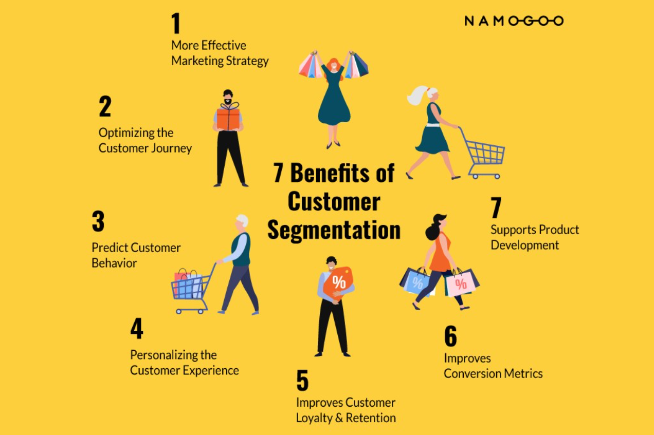
Marketers perform complex segmentation across demographic, psychographic, behavioral, and preference data for each customer to deliver personalized products and services. To do this at scale, they leverage data science techniques like supervised learning.
Data scientist Rebecca Yiu’s project on market segmentation for a fictional organization, using R, principal component analysis (PCA), and K-means clustering, is an excellent example of this. She uses data science techniques to identify the prospective customer base and applies clustering algorithms to group them. She classifies customers into clusters based on age, gender, region, interests, etc. This data can then be used for targeted advertising, email campaigns, and social media posts.
You can learn more about her data science project here.
Road Lane Line Detection
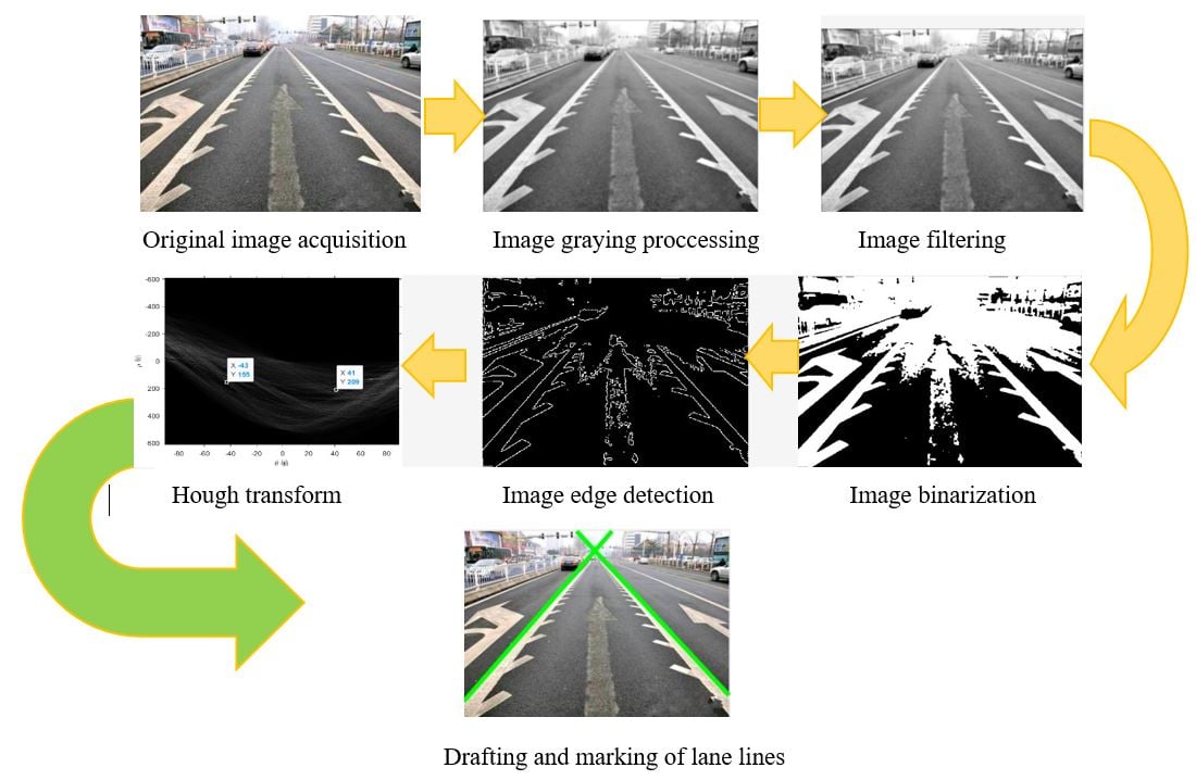
To follow lane discipline, self-driving cars need to detect the lane line. Data science and machine learning can play a crucial role in making this happen. Using computer vision techniques, you can build an application to autonomously identify track lines from continuous video frames or image inputs. Data scientists typically use OpenCV library, NumPy, Hough Transform, Spacial Convolutional Neural Networks (CNN), etc., to achieve this.
You can access a sample video for this project from this git repository here.
Intermediate Data Science Projects
NFL Third and Goal Behavior
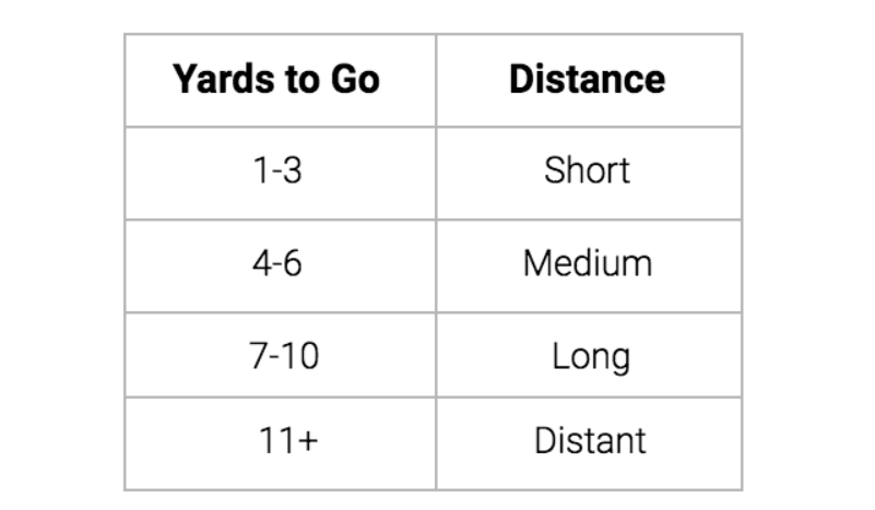
The intersection of sports and data is full of opportunities for an aspiring data scientist. Divya Parmar, a lover of both, decided to focus on the NFL for his capstone project during Springboard’s Introduction to Data Science course. His goal was to determine the efficiency of various offensive plays in different tactical situations.
Parmar collected play-by-play data from Armchair Analysis, and used R and RStudio for analysis. He developed a new data frame and used conventional NFL definitions. Through this data science project, he learned to:
- Assess the problem
- Manipulate data
- Deliver actionable insights to stakeholders
You can access the dataset here.
Who’s a Good Dog? Identifying Dog Breeds Using Neural Networks
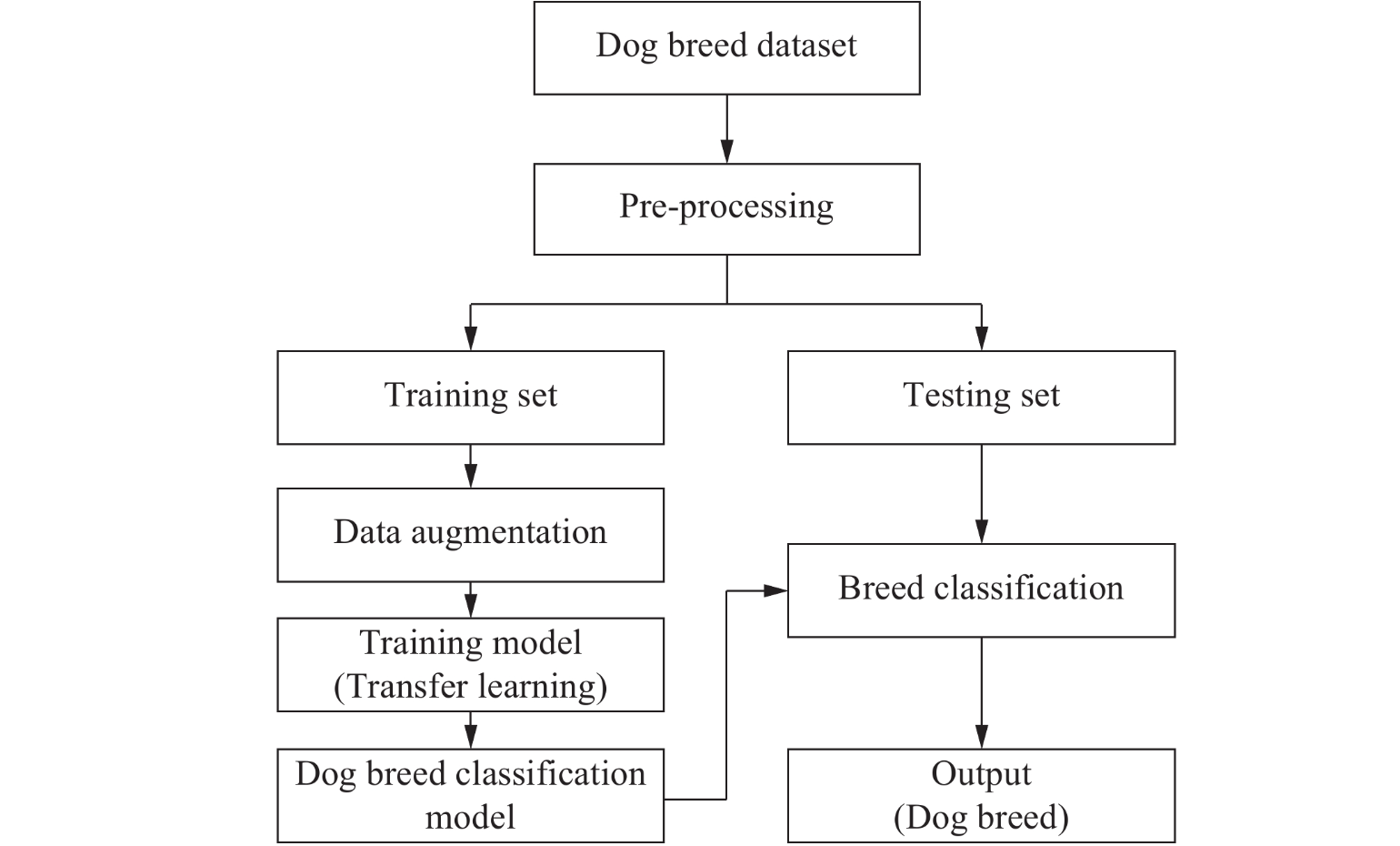
Image classification is one of the most popular and widely in-demand machine learning projects. Classifying dogs based on their breeds by looking into their image is a highly loved data science project. Garrick Chu, a graduate of Springboard’s Data Science Career Track, chose this for his final year data science project submission.
One of Garrick’s goals was to determine whether he could build a model that would be better than humans at identifying a dog’s breed from an image. Because this was a learning task with no benchmark for human accuracy, once Garrick optimized the network to his satisfaction, he went on to conduct original survey research to make a meaningful comparison.
He worked with large data sets to effectively process images (rather than traditional data structures) with network design and tuning, avoiding over-fitting, transfer learning (combining neural nets trained on different data sets), and performing exploratory data analysis.
To do this, he leveraged neural networks with Keras through Jupyter notebooks. You can explore more of Garrick’s work here and access the data set he used in his data science project here.
Uber’s Pickup Analysis Data Science Project
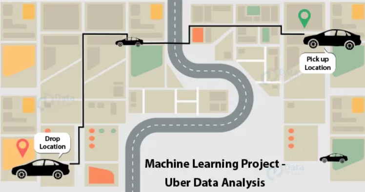
Is Uber Making NYC Rush-Hour Traffic Worse?—This was one of the four questions answered by FiveThirtyEight, a data-driven news website now owned by ABC. If you are looking to improve your data analysis and data visualization skills, this is a great data science project.
For this, FiveThirtyEight obtained Uber’s rideshare data and analyzed it to understand ridership patterns, how it interacts with public transport, and how it affects taxis. They then wrote detailed news stories supported by this data analysis. You can read their work of data journalism here. You can access the original data on Github.
Predicting Restaurant Success Data Science Project
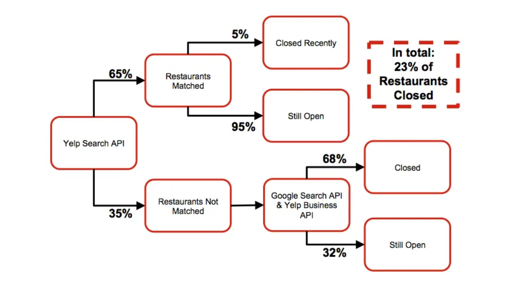
Here is another Yelp-based project, but more complex than the one we discussed earlier. Data expert Michail Alifierakis used Yelp data to build his “Restaurant Success Model” to evaluate the success/failure rates of restaurants. He uses a linear logistic regression model for its simplicity and interpretability, optimized for the precision of open restaurants using grid search with cross-validation.
This is a great data science use case for lenders and investors, helping them make profitable financial decisions. You can learn more about the data science project from here and take a look at the code on GitHub.
Predictive Policing
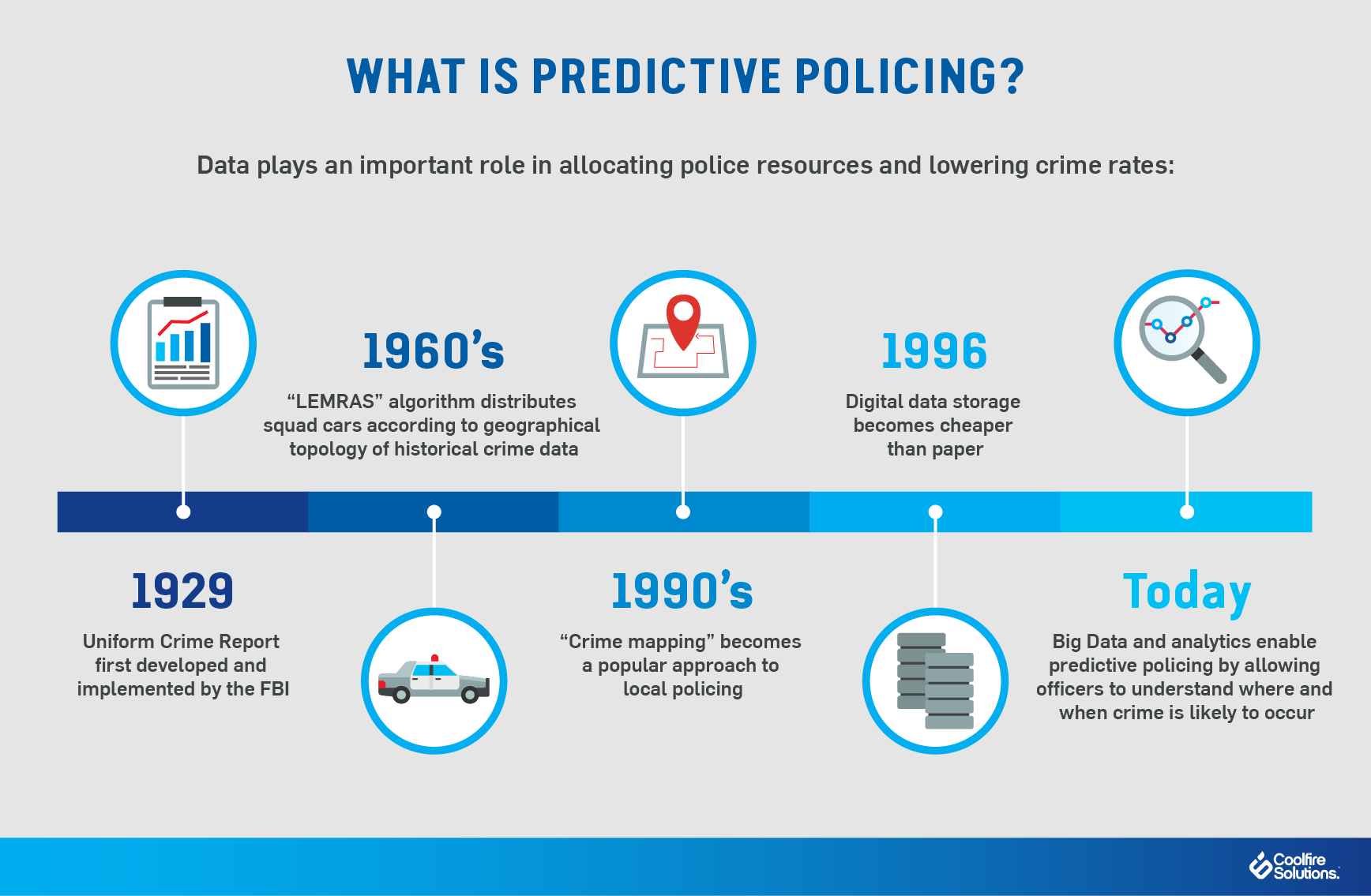
Many law enforcement agencies worldwide are moving towards data-driven approaches to forecasting and preventing crimes. They leverage data science technologies to automate the pattern detection process that will help to reduce the burden on crime analysts. Data scientist Orlando Torres launched a data science project on predictive policing, albeit to unexpected results. He used data from the open data initiative and trained the model on 2016 data to predict the crime incidents in a given zip code, day, and time in 2017. He used linear regression, random forest regressor, K-nearest neighbors, XGBoost, and deep learning model — multilayer perceptron.
With this data science project, he learned that it is very easy to lose explainability while building models. He writes, “if we start sending more police to the areas where we predict more crime, the police will find crime. However, if we start sending more police anywhere, they will also find more crime. This is simply a result of having more police in any given area trying to find crime.” Given the number of law enforcement agencies using data science for policing, it almost feels like a self-fulfilling prophecy.
You can read more about his project here.
Building Chatbots
Today, businesses are automating their customer services with chatbots. Creating your own chatbot can be a great data science project too. The two types of chatbots available today are domain-specific chatbots and open-domain chatbots. They both use Natural Language Processing (NLP) and Recurrent Neural Networks (RNN). For an intermediary data scientist, you can perhaps take this up a notch—try creating a sensitive chatbot with capabilities to detect user sentiment.
Patrick Meyer runs a data science project of this kind. He discusses using the polarity system to identify happy, neutral, and unhappy; Paul Ekman’s initial model with six emotions—anger, disgust, fear, joy, sadness, and surprise or his extended list of sixteen; Robert Plutchik’s wheel of emotions and Ortony, Clore, and Collins (OCC) model.
You can learn more about his detection techniques here. And access the dataset here.
Advanced Data Science Projects
Amazon vs. eBay Analysis
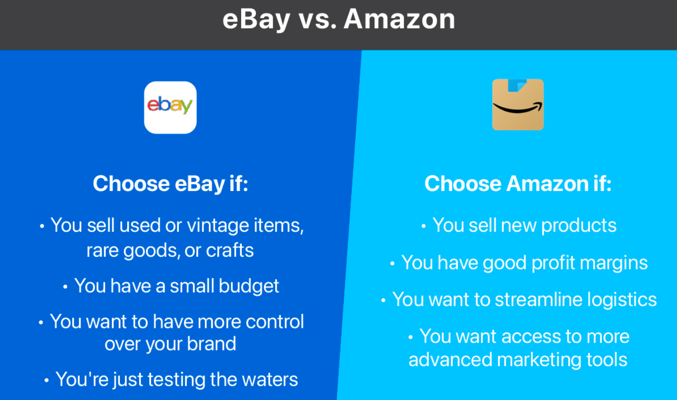
Finding the lowest price for a product on the Internet makes up a significant part of online shopping. Chase Roberts decided to make that easier. In support of a Chrome extension he was building, Roberts compared the prices of 3,500 products on eBay and Amazon. The results showed the potential for substantial savings. For his project, Roberts built a shopping cart with 3,520 products to compare prices on eBay vs. Amazon. Here’s what he found:
- If you chose the wrong platform to buy each of these items (by always shopping at whichever site has a more expensive price), this cart would cost you $193,498.45. (Or you could pay off your mortgage.) This is the worst-case scenario for the shopping cart.
- The best-case scenario for our shopping cart, assuming you found the lowest price between eBay and Amazon on every item, is $149,650.94. This is a $44,000 difference—or 23%!
You can read more about his project, starting with how he gathered the data and documenting the challenges he faced during this process.
Fake News Detection

A recent study revealed that false news spread faster and reached more people than the truth and around 52% of Americans shared that they regularly encountered fake news online. A four-person team from the University of California at Berkeley built a fake news classifier. For this, the team focussed on clickbait and propaganda, the two common forms of fake news. They then developed a classifier that would detect these two forms. Their process involved:
- Taking data from news sources listed on OpenSources
- Used NLP to do the preliminary processing of articles for content-based classification
- Trained various machine learning models to divide the news articles
- Developed a web application to act as the front end of their classifier.
You can learn and try out more about this here.
Audio Snowflake

When you think about interesting projects, chances are you think about how to solve a particular problem, as seen in the examples above. But what about creating a project for the sheer beauty of the data? For her Hackbright Academy project, Wendy Dherin did just that.
She developed Audio Snowflake to create a splendid visual representation of music as it played, capturing specific components like tempo, key, mood, and duration. Audio Snowflake mapped both quantitative and qualitative characteristics of songs to visual traits like saturation, color, rotation speed, and figures it produces.
Visualizing Climate Change
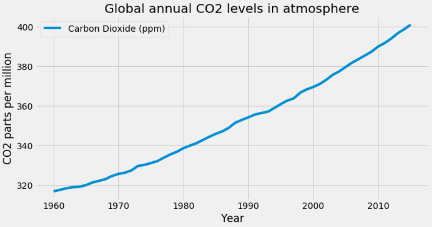
2020 was recorded as the warmest year to date by NASA, and the last seven years have been the warmest seven years on record. Climate change is one of the most pressing issues humans face today. It is more important than ever to spread awareness and inform people of the magnitude of this problem. Data visualization can play a crucial role in that.
The data scientist Giannis Tolios did a project where he visualized the changes in global mean temperatures and the rise of CO2 levels in the atmosphere using Python. He uses various libraries such as Pandas, Matplotlib, and Seaborn for the data, visualizing it in line graphs and scatterplots. If climate change is a topic you want to work on, you can learn more about the project here.
Democratizing Data Science at Uber
One of the key challenges in data science is that it requires one to be a mathematician or a statistician even to make basic predictions and forecasts. Uber’s data science platform overcomes this challenge by automating forecasting using pre-built algorithms and tools, enabling everyone on the team to get predictions as long as they have data.
Director of Data Science at Uber, Franziska Bell, talks about how they plan to give the capabilities of a data scientist to every Uber employee. This way, Uber uses artificial intelligence, machine learning, and data science to solve real-world problems. Read more about it here.
Credit Card Fraud Detection
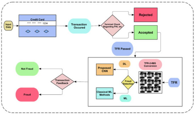
With online and digital transactions gaining more popularity today, their chances of being fraudulent are also on the rise. Therefore banks and financial institutions are looking to leverage machine learning techniques to identify fraudulent transactions and prevent them from being executed. By processing data across customer location, behavior, transaction value, network, payment method, etc., you can train the machine learning algorithm to detect anomalies. You can build your classification engine for fraud detection using decision trees, K-nearest neighbor, logistic regression, support vector machine, random forest, and XGBoost.
Datasets for Data Science Project Ideas
Here are some online data sources which you can access and download for free for your data science projects:
- VoxCeleb. A gender-balanced, audio-visual data set containing short clips of human speech from speakers of different ages, professions, accents, etc. They are extracted from interviews uploaded to YouTube. It can be used for various applications like speech separation, speaker identification, emotion recognition, etc.
- Boston Housing Data. A fairly small data set based on the information collected by the U.S. Census Bureau data regarding housing in Boston. This data set can be used for assessment, focusing on the regression problem.
- Kaggle. With over 50,000 public datasets on a wide range of topics, you can find all the data and code that you require to do your data science project ideas. They also offer competitive data sets that are clean, detailed, and curated.
- National Centres for Environmental Information. The largest storehouse of environmental data in the world, this provides information on the oceanic, atmospheric, meteorological, geophysical, climatic conditions, and more.
- Global Health Observatory. If you are interested in doing projects in the health industry, then this is the best place to get the data you need. It also has some of the latest COVID-19 data.
- Google Cloud Public Datasets. A place where you can access data sets that are hosted by BigQuery, Cloud Storage, Earth Engine, and other Google Cloud services.
- Amazon Web Services Open Data Registry. This has an extensive repository of data sets that you can either download and use or analyze on the Amazon Elastic Compute Cloud (Amazon EC2). You need to first create a free AWS account to get access to the data sets.
Tips for Creating Interesting Data Science Projects
To help you navigate the world of data science projects, we asked Springboard mentors and instructors for their advice. Here’s what they had to say.
Choose the Right Problem
If you’re a data science beginner, it’s best to consider problems that have limited data and variables. Otherwise, your project may get too complex too quickly, potentially deterring you from moving forward. Choose one of the data sets in this post, or look for something in real life that has a limited data set. Data wrangling can be tedious work, so it’s critical, especially when starting out, to make sure the data you’re manipulating and the larger topic is interesting to you. These are challenging projects, but they should be fun!
Breaking Up the Data Science Project Into Manageable Pieces
Your next task is to outline the steps you’ll need to take in order to create your data science project. Once you have your outline, you can tackle the problem and develop a model to prove your hypothesis. You can do this in six steps:
- Generate your hypotheses
- Study the data
- Clean the data
- Engineer the features
- Create predictive models
- Communicate your results
Generate Your Hypotheses
After you have your problem, you need to create at least one hypothesis to help solve the problem. The hypothesis is your belief about how the data reacts to certain variables.
This is, of course, dependent on you obtaining the general demographics of specific neighborhoods. You will need to create as many hypotheses as you need to solve the problem.
Study the Data
Your hypotheses need to have data that will allow you to prove or disprove them. Look in the data set for variables that affect the problem. If you do not have the data, either dig deeper or change your hypothesis.
Clean the Data
As much as data scientists prefer to have clean, ready-to-go data, the reality is seldom neat or orderly. You may have outlier data that you can’t readily explain, like a sudden large, one-time purchase of an expensive item in a store that is in a lower-income neighborhood. Or maybe one store didn’t report data for a week.
These are all problems with the data that aren’t the norm. In these cases, it’s up to you to remove those outliers and add missing data so that the data is more or less consistent. Without these changes, your results will become skewed, and the outlier data will affect the results, sometimes drastically.
Engineer the Features
At this stage, you need to start assigning variables to your data. You need to factor in what will affect your data. Does a heatwave during the summer cause sales to drop? Does the holiday season affect sales in all stores and not just middle-to-high-income neighborhoods? Things like seasonal purchases become variables you need to account for.
Create Your Predictive Models
At some point, you’ll have to come up with predictive models to support your hypotheses. For example, you’ll have to write code to predict sales. You may explore whether an after-Christmas sale increases profits and, if so, by how much. You may find that a certain percentage of sales earns more money than other sales, given the volume and overall profit.
Communicate Your Results
In the real world, all the analysis and technical results you come up with are of little value unless you can explain to your stakeholders what they mean in a comprehensible and compelling way. Data storytelling is a critical and underrated skill that you must develop. To finish your project, you’ll want to create a data visualization or a presentation that explains your results to non-technical folks.
Get To Know Other Data Science Students

Leoman Momoh
Senior Data Engineer at Enterprise Products

Sunil Ayyappan
Senior Technical Program Manager (AI) at LinkedIn
Lou Zhang
Data Scientist at MachineMetrics
Putting It All Together
Remember your data science project isn’t just about learning algorithms and code. Each data science project is a real-world playground to showcase your skills and make a tangible impact. Let’s explore how your data science project idea pays off in the real world:
- Fake News Buster: Train a logistic regression model on text data to identify fake news articles. This data science project showcases your ability to perform sentiment analysis, understand natural language processing, and even contribute to tackling disinformation campaigns.
- Traffic Signs Recognition Project: Implement convolutional neural networks to build a Python program that recognizes all the traffic signs from input images. This data science project idea demonstrates your skills in image processing, deep learning, and creating practical applications that can improve road safety.
- Brain Tumor Detection: Analyze MRI scans using k-means clustering to identify potential tumor locations. This data science project highlights your grasp of unsupervised learning, medical data analysis, and potentially contributing to advancements in early cancer detection.
- Drowsiness Detection System: Develop a system that analyzes facial expressions and eye movements to detect driver drowsiness using facial recognition libraries in Python. This showcases your ability to apply AI for real-time risk assessment and potentially saving lives on the road.
- Personalized Recommendation System: Analyze customer behavior using credit card transactions to recommend relevant products or services. This demonstrates your skills in data cleaning, feature engineering, and building systems that drive business growth and improve customer satisfaction.
These are just a few examples. Remember, even personal projects can have real-world implications. Analyzing your own spending habits to understand them better or generating image captions can hone your data science skills and spark even more impactful ideas. Don’t be afraid to experiment, learn from the source code of existing projects, and keep exploring the potential of data science to make a difference in the world.
So, whether you’re battling fake news, recognizing traffic signs, spotting fraudulent credit card transactions, or recommending that perfect purchase, let your data science projects showcase your skills and make a positive impact on the world!
Data Science Projects FAQs
How Do You Measure the Success of Data Science Projects?
As a learner, the most critical measure of success is that you have put your skills and knowledge to practice. Good data science projects not only show that you can solve problems but also shows the potential employer how you approach problem-solving. As long as you can add your project to your portfolio, consider it successful.
How Can You Find Interesting Data Science Projects To Try?
This blog post should get you started on various projects you could take up. Online courses like the Springboard Data Science Bootcamp include real-world projects that amplify your portfolio. You can contribute to open-source projects. You can also participate in competitions on platforms like Kaggle and Driven Data to improve your model-building skills.
How Can You Showcase Your Data Science Projects?
You can:
– Include it in your resume
– Link them to your Linkedin profile
– Maintain an active Github account
– Create your data science portfolio website
– Write case studies of your more simple data science projects and publish them on a blog/Medium
You can also share live data science projects on appropriate forums. The best data science projects showcase your knowledge of data analysis techniques to solve practical issues, e.g. a traffic signs recognition project.
Since you’re here…Are you interested in this career track? Investigate with our free guide to what a data professional actually does. When you’re ready to build a CV that will make hiring managers melt, join our Data Science Bootcamp which will help you land a job or your tuition back!