Free UX Design Course
Dive into UX design with our free starter course. Transform your creative ideas into user-friendly solutions.
UI designers are constantly trying to strike a balance between aesthetics and usability. Both are important in equal measure, and oftentimes, UI designers are forced to choose between what looks best and what will create the most intuitive user experience.
So if you’re an aspiring UI designer, you may be wondering: how do you strike the right balance?
We think that one of the best ways to learn is by example. That’s why we’ve compiled this list of our seven favorite UI design examples. Ready? Then let’s get started.
What Is UI Design?

User interface (UI) design is the process of developing and creating menus and tools that allow users to navigate a digital product. This includes websites, mobile apps, train ticket machines, TVs, coffee machines, and much more. Successful UI design combines enjoyable visual experiences with smooth interactions.
Our Favorite UI Design Examples
Below, we’ve listed our 7 favorite UI design examples, and why we love them.
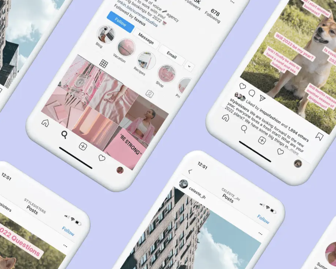
Nike Reactor’s Fun Interaction Design

The Nike React store helps users find their perfect sneakers by asking a series of quirky questions about their ideal texture, running style, and color.
Why We Love It
For consumer industries such as fashion, user experience design aims to create a happy customer, develop brand loyalty, and motivate repeat business. This gives companies a lot of freedom to experiment with their UI and create unique, fun experiences that provoke a smile and a social media post from the user.
The Nike React store does exactly this, by greeting users with a futuristic AI interface and a series of silly questions which result in a strange running figure composed of random objects. Users can name and download their curious creations, which leads to social media interactions and increased exposure for the products.

The entire experience is quick, smooth, and optional, so that it detract from the practicality of the store’s UI. We also love how this creative, light-hearted, and humorous user interface boosts marketing through engaging visuals and fun content.
Medium’s Minimalism
Medium is an open publishing platform for blog posts, articles, stories, and essays on any topic.
Why We Love It
By choosing a uniform and minimalistic UI and page design for all posts, Medium encourages users to focus on its written content. Quality is not signaled by professional graphics and personalized pages, but simply by the thoughts and ideas put forward in writing. This creates an atmosphere of inclusion and equality between professional writers and amateur contributors that post content on the platform and encourages an environment where the best content wins.

This minimalist UI design also highlights the absence of adverts on the site, which is an integral design element of Medium’s model for digital publishing. Without adverts influencing what users click on, the content is further able to speak for itself, promoting nuanced and complex discussions.
Duolingo’s Multi-Sensory and Gamified Design
Duolingo is a language learning platform that offers courses in over 35 languages and aims to make online language study universally accessible and fun.
Why We Love It
From the get-go, Duolingo immerses its users in the world of language learning with content that utilizes both visual and audio-based activities. Users read, write, listen, and speak in their target language to answer questions that develop both their input and output skills.

Not only are all four areas essential for language learning, but they also ensure a level of engagement that keeps users’ attention for longer, especially since they don’t know which kind of question will be coming next. To keep users focused, Duolingo also makes use of a point-earning, level-climbing system that transforms the studying experience into something similar to a video game.

Players are incentivized by future modules that the UI displays to show what kinds of grammar and topics they’ll be able to cover next, along with a competitive score system that pits users against each other and crowns the winner each week.
Like many mobile games, Duolingo also makes use of login streaks and bonuses to keep users coming back every day.
Get To Know Other Design Students

Jane French
Founder at Ella Verbs

Jenny Kim
Content Creator/influencer at Self-employed

CJ Hernandez
Senior Designer at StellarFi
Salesforce’s Accessibility Features
Salesforce is a leading customer relationship management (CRM) platform that helps sales professionals provide an organized, quality service to a larger number of customers.
Why We Love It
Sales teams are an integral part of many businesses in a variety of industries — The U.S. Bureau of Labor Statistics reported 985,200 people employed in a general sales representative role in 2020, and this doesn’t even take into account small business owners that make use of the platform as well.

At Salesforce, UI designers and engineers understand that there is no limit to the kinds of people that can find value in their product, and work to make it as accessible as possible.

For example, Salesforce features are compatible with text-to-speech and braille translation tools to help users navigate the product easily and efficiently without the need for vision. This kind of work is very important within the UI industry, as it begins to break down barriers for disabled individuals in many fields who, aside from being unable to navigate screen-based interfaces, are completely capable and qualified for the job.
Spotify’s Design Consistency

Spotify is a music streaming service that hosts a huge range of both label and independent music.
Why We Love It
Since Spotify is such a huge platform with over 80 million tracks to choose from, UI design consistency plays an important role in making the product look and feel unified.
Square icons for tracks and albums, and circular icons for artists ensure users always know what they’re looking at, while the profile and album pages receive just a hint of personalization through background colors that match album covers.
Google Search’s Simplicity

This search engine used by billions of people worldwide needs no introduction.
Why We Love It
Simplicity is key when a user is trying to uncover the piece of information they want amongst a sea of related content. The all but empty homepage shows that Google understands that the user has come to its page with a goal, and doesn’t benefit from a homepage full of distractions.
Striking Use of White Space on Apple’s Homepage

Apple is known for its ubiquitous iPhone as much as it is for its crisp, clean, and minimalist aesthetic.
Why We Love It

Apple is one of the most well-recognized brands in the world, and over 55% of smartphone owners in the United States use iPhones. This level of brand awareness allows Apple to take a minimalist approach to its UI and sales techniques.
High-resolution images of products take center stage against a white background and a minimal amount of text, taking advantage of a user’s pre-existing knowledge of their brand, and encouraging them to focus on the beauty of the product. Apple’s aesthetic is so well-known and well-loved that it can be attributed as a design inspiration for many other products and companies.
UI Design Principles
Below, we’ve outlined some of the key user interface design skills and principles that make these examples so effective.
If you’re interested in learning more about UI design as a career, check out Springboard’s UI/UX Design Bootcamp and launch your UI career today.
Keep It Stupid, Simple (KISS Principle)
This design principle reportedly originated in the US Navy, to promote system designs that could be easily navigated and repaired by non-specialist workers in combat situations.

The KISS Principle prioritizes simplicity and ease of use above all else and is generally recognized and agreed with by most UI designers.
Consistency Is Key

Ensuring consistency can be a more complicated job than you might expect, as every design element must be consistent in order to create a smooth experience.
Users will quickly develop an “intuition” for how your UI should work based on patterns they observe at the beginning of their experience, and it’s essential for designers to ensure their UI conforms to this intuition.
Design for the User, Not Yourself
Considering a UI designer’s in-depth knowledge of the product they are working with, designing for themselves would be a significant mistake. The user interface must be comprehensible for users with little to no understanding of the design project, and so must not rely on any assumption of prior knowledge.
Accessibility Is Vital

Ensuring that your product can be used by as many people as possible is a key goal of any user interface. This means including documentation for users who require further explanation, options to switch color schemes and font sizes for improved visibility, the option to turn off flashing imagery, and audio features for users with low vision.
Provide Feedback

Feedback refers to the way a UI responds to a user’s actions, often by offering tips and advice for better results or showing error messages to explain why the software can’t complete the task being asked of it.
Without feedback, a user may be unable to understand why your product won’t respond to their inputs, and this causes friction which can ruin their experience very quickly.
Aesthetics Matter
As mentioned above, the KISS Principle is a key part of the design process, but for consumer goods industries, the aesthetics of a product need to be considered as well.
As products and companies compete with each other for the attention and patronage of the consumer population, creating standout products with pleasing aesthetics is arguably equally important as usability.
Clarity and Intuitiveness Are Important
When a UI prioritizes clarity, a user will never be unsure of what a feature does or be surprised when a feature is activated before they expected. This kind of clarity reduces the number of mistakes a user makes and allows the user to feel in control.
Related Read: 16 Important UX Design Principles for Newcomers
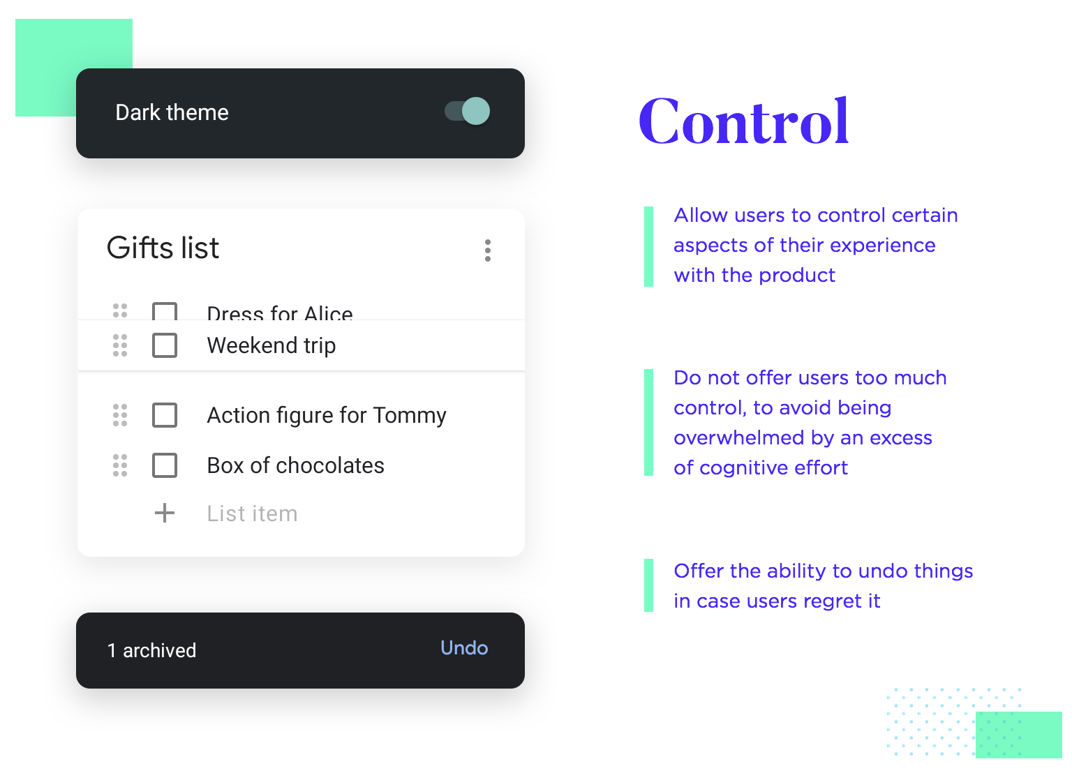
Let the User Be in Control
By adhering to the principles outlined above, you’ll be able to give the user a sense of control. When the UI has a responsive design, simple features, and visual cues are consistent and easy to intuit, the user will feel confident in their ability to use the product and achieve their desired results.
Since you’re here…
If you’re looking to move into design, having strong UX and UI skills is a major edge. Our UI/UX Design Bootcamp has earned graduates jobs with the most competitive organizations on earth, and 99.5% of our students are fully employed within 12 months of graduation. Check out our student reviews for good feels, and If you’re totally new to the field, try our free intro course.

![How to Become an Information Architect [2023 Career Guide]](https://www.springboard.com/blog/wp-content/uploads/2020/07/how-to-become-an-information-architect-2023-career-guide.jpeg)