
Free UX Design Course
Dive into UX design with our free starter course. Transform your creative ideas into user-friendly solutions.
UX design is a creative and ever-changing field that welcomes fresh ideas from new practitioners, but there are some foundational UX design principles that every new designer should understand.
The Interaction Design Foundation defines UX principles as “fundamental points of advice for making easy-to-use, pleasurable designs as we select, create and organize elements and features in our work.” Design principles, therefore, form the heart and soul of UX design. Consequently, as new designers, it is essential that you learn these guidelines and consider aligning your design practice with them.
Let’s walk through these user experience design principles so that you’re prepared to launch a fulfilling career.
Want to know more about how to become a UI/UX designer? Visit our comprehensive job guide to UI/UX design here!

Become A UX Designer. Land a Job or Your Money Back.
Master Adobe XD, Figma, and Sketch. Work 1:1 with an industry mentor. Build a portfolio. Land a job — or your money back.
UX Principles
1. Meet the users’ needs
The foremost of all UX design principles is to focus on users throughout the design process. The term user experience itself makes it clear that your work needs to center on improving your users’ experience with your product or service.
Thus, you need to learn what users are looking for in a design (through user testing and other methods). It is possible that a design may seem brilliant to you, but remember that you are not the user.
Springboard alum and UX designer Jeremy Nigh put it this way:
“All too often I have designed on an island by making assumptions based on what I think an end user needs, crafting pixel-perfect mockups based on my assumptions. I’ve learned that the ‘U’ in UX does not stand for ‘you’! It’s all about the user, so getting outside of my head and engaging with the user is an important step in the design process.”
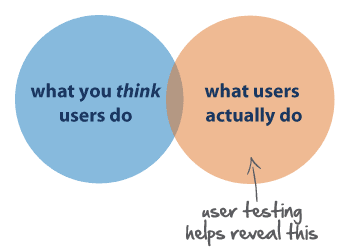
Source: i3lance
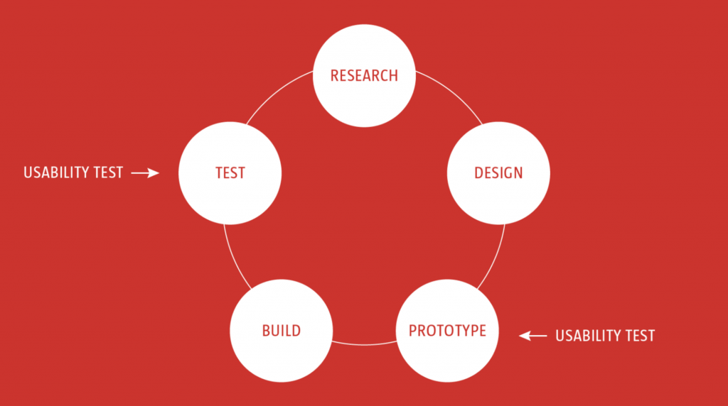
2. Know where you are in the design process
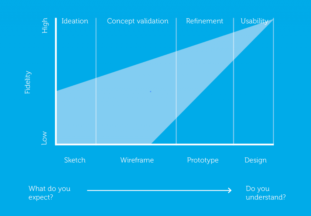
For new UX designers who are only just testing the internship waters or are in junior positions, the design process can be overwhelming. A lot of work goes into designing, so knowing your place in the process is significant in several ways.
Firstly, you’ll need to use different UX tools for each phase, as demonstrated in the graph below. Secondly, knowing your design phase also helps you ask the right questions for user research. For instance, there’s is no point testing the color of a button if you are still figuring out where it should be placed in the design.
3. Have a clear hierarchy
It is easy to take hierarchy for granted, but it is a UX principle that ensures smooth navigation throughout a design. There are two chief hierarchies that you need to note. First comes the hierarchy that is associated with how content or information is organized throughout the design.
For example, when you open a website or app, you will note the navigation bar that includes the main sections. This is the primary hierarchy. When you click or hover over this bar, you will note further sub-categories of content open up, taking you deeper into the app or site. These are the secondary menus.
This site map shows primary and secondary menus:
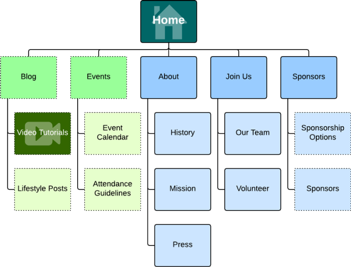
Source: Lucidchart
Now take a real example from the WooCommerce site:

There also is a visual hierarchy, which allows users to navigate easily within a page or section. Therefore, to create an easy flowing design for users, you need to place the important content prominently.
The WooCommerce site uses a large font and weight for the main message so that it stands out. The design also uses a different colored button to put emphasis on “Get Started” and encourage action.
4. Keep it consistent
Users expect products to share some similarities with other products they regularly use. This makes it easy for them to become familiar with the new product without any additional learning costs. It may sound a little counterintuitive, but the more familiar your design is to others, the faster users can learn to use it, which enhances their experience.
Get To Know Other Design Students

Parker Konz
Visual Designer at Gorilla Group

Jiyoung An
Product Designer at Nav Technologies

Natalie Breuner
UX Designer And Researcher at Magoosh
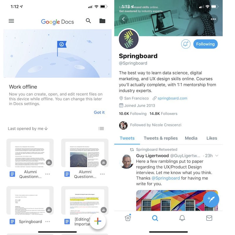
Such consistency also makes the design process easier for the designers, as they don’t have to reinvent the wheel every time they take on a new project. A case in point is the floating action button that has become common among apps, as seen in the Twitter and Google Docs apps below:
5. Understand accessibility
An increasingly important rule from among the UX design basics is designing with accessibility in mind. In simple words, a designer’s responsibility is to make sure their design is usable for as many people as possible. This means that your design needs to be accessible to people with disabilities too.
To this end, you should remove obstacles from the design layout for problem-free navigation. For example, you can use contrasting colors for the text on the background. This helps visually impaired users (as well as users in low-light settings) read the content on the screen more easily. Slack excels at this on its blog:
6. Context is key
When designing, you need to take into account the user’s context. Location is a commonly understood contextual factor—are you designing for someone on the go or for someone sitting at a desk? But there are other things to consider, including the time available with the user, their emotional state, the device they are using, the people who influence them, and more.
All these factors help you understand the user’s behavior. Once you have insight into that, you can prepare a design that maximizes user experience. For example, the emotional state of a user would impact how patient or impatient they might be when interacting with the user interface of your product or service, so you’d want to design with that in mind.

Source: app ticles
7. Usability first
UX design is entirely focused on solving the users’ problems, which makes usability of the design one of the most crucial user experience design principles. No matter how aesthetically pleasing your work may be, it won’t strike a chord with the user unless it is safe and easy to use.
A case in point here is website design. Any site that is cluttered is bound to lose visitors. As a designer, your job is to make sure that each icon, button, and snippet of information that is present within the design has a purpose. Concentrate on clarity by bringing only useful features to the user’s attention.
Usability is the reason why prominent buttons and a minimalist design with few elements increase the click-through rate (CTR). Precision Marketing Group doubled the CTR on their call-to-action button by changing the shape and size of the button.
Usability testing asks users to interact with the design. Meanwhile, you take notes to see whether they encounter any problems.
If many people experience similar problems, you will have to make changes to the design to sort out the usability issue. Keep in mind that design is an iterative process and it demands improvements in all stages.
Hence, you should conduct usability tests throughout the UX design process, including before you start your initial design, during the prototyping phases, and at the end of the process.
Source: Smashing Magazine
8. Less is more
The less-is-more design principle was originally proposed by the architect Ludwig Mies van der Rohe. For UX, the underlying aim of this is simple: reducing the operational and cognitive costs of the users. In placing value on this, the design’s usability and consistency improve.
The less-is-more approach emphasizes simplicity as opposed to clutter or over-decoration in design. Several celebrated designs have surfaced as a result of this UX design principle, including the iPhone and iPod. In 2007, Apple streamlined the phone’s keyboard in pursuit of the less-is-more philosophy and the iPhone was birthed. Apple’s website also follows the same design principle.

Source: Apple
9. Use simple language
Just as simplicity has become a best practice in visual design, UX-focused copywriting should avoid technical terms and opt for simple language. Users are busy, they’re on the go, they’re multi-tasking, so use words in your design that are closest to the user’s thoughts.
Simple language is easy to understand, which enhances your design’s user-friendliness.
You need to factor in five points as you choose simple words for your design. These are:
- Audience and purpose of the design: question who your audience is, what information they have, what they need, and what they will want to achieve with your communication
- Structure: ask about the common structures for your communication, what structures your readers are familiar with, and what sequence will be easy to read
- Design layout: focus on the typography, layout, and information graphics
- Expression: consider the tone, verbs, sentence length, jargon, and choice of words your communication will adopt
- Evaluation: have someone review the text you finalize and conduct a usability test
Put simply: use clear and consistent words throughout your design to reduce ambiguity. In this example, the “OK” is unclear. “Yes” is a more logical choice. Got it? (OK!)
10. Typography is powerful
Equally important to the words you use in your design is typography. The author of “The Elements of Typographic Style,” Robert Bringhurst, highlights the role of this UX design principle well. He writes, “Typography is the craft of endowing human language with a durable visual form.”
Typographic choices can significantly impact the way users interpret the language you use, helping enhance or suppress the message. Moreover, typography can improve UX in multiple ways.
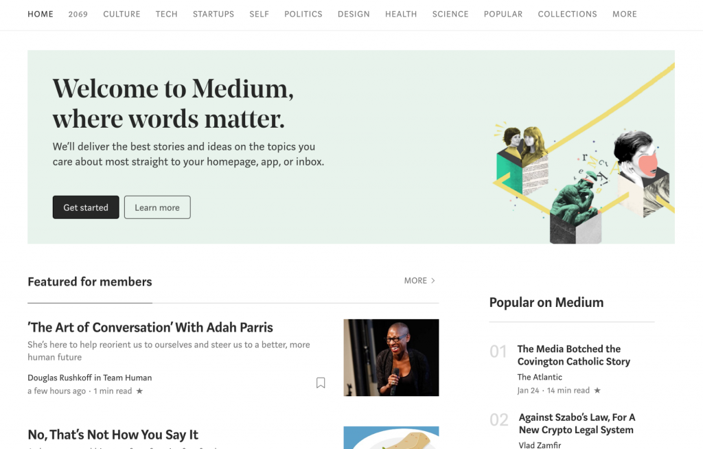
For instance, it can improve accessibility and make the design more user-friendly as you consider a typographic hierarchy. You can take a page from the online publishing platform Medium’s design. Medium uses specific typography to make its content more readable.
11. Feedback matters
Design should be interactive by nature. So, when a user clicks on something, they will need a response from the product to understand that their command has been received. Feedback is a crucial way to encourage communication between humans and machines.
Your design may respond in various ways. The clicked icon may change shape, vibrate, discolor, emit light, and so on. Notice how the color reacts as you click a link on the Zapier website:
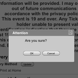
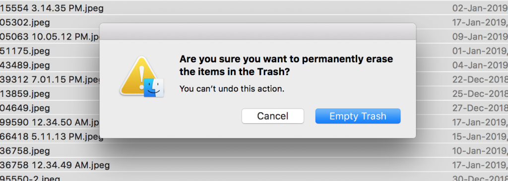
12. Confirm before you commit
Accidents happen all the time. One common digital example: a person may unintentionally place an order. (How many parents have had to ask for refunds after their young kids accidentally made a purchase on Amazon or iTunes?) Your design should help correct this, though, because you don’t want to give the user a poor experience. This makes confirmation another one of the essential UX design principles.
Apple asking for confirmation when you empty the trash is one important way this principle is put into use.
13. The user is in control
User control focuses on greater flexibility of use and better control of where a user is within a design or product, enhancing user experience. Furthermore, it allows users to backpedal and recover from errors.
The “upward” icon on a webpage, which allows you to get to the top of the page, is a good example (see below). Similarly, the “cancel” button that allows users to abandon the task they were doing also empowers them. As does the “undo” button, which saves a user from making an unintended action.
Source: Smashing Magazine
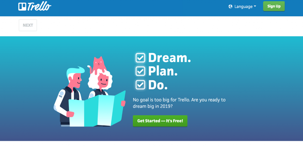
14. Design with personality
Your design can attract more users if it showcases a character that interests the user persona you are designing for. Users find it hard to connect with a lifeless design, device, or code.
Adding personality to your design gives it the human touch that makes it more attractive and usable (like the Trello blog).
15. Visual grammar
Visual grammar has its roots in graphic design, but it sits at the helm of all visual communication, which plays a significant role in user experience. Visual grammar consists of everything that makes up the visual elements of a design: icons, illustrations, patterns, and more.
Break these down and you will get the core elements of planes, points, and lines, as shown below. Your job as a new designer is to ensure that you understand these elements better for improved visual grammar.
Focus on one point at a time, starting from points, then lines, and finally planes. As you improve on this user experience design principle, you will be able to improve your overall UX design skill set.
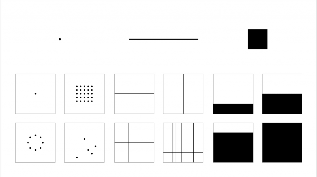
Source: Smashing Magazine
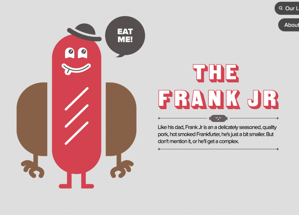
16. Narrative design
Another one of the most important user experience design principles is narrative design, or telling a story with your design. Two critical storytelling elements are time and rhythm. Time is the pacing your design adopts—for example, how slowly or quickly your narrative is unveiled.
Similarly, rhythm is the pattern of unfolding that your narrative adopts—for instance, the pattern of the series of screens through which the entire design opens up. Too slow a pace can bore your user, not giving them adequate information to hold their interest.
On the flip side, a fast pace can inundate the user with information, which can confuse them. Therefore, you need to balance pace and rhythm. Check out the Big Apple Hot Dogs website to note how the design uses narrative storytelling:
As you step further along the path to a career in UX design, you’ll want to acquaint yourself with the common UX terms and UX design basics. Aligning your work with these UX design principles will improve your output and set you up for success as a UX designer.
Since you’re here…
Are you a future UX designer? Enroll in our UI/UX Bootcamp and join over 10,000 students who have successfully changed careers with us. Want to get wireframing right this second? Check out our free UX design course today.